Universal Web Design Principles That Improve Usability And Conversion

I used to spend thousands of dollars hiring designers to create some fancy-looking web pages only to find out that they did nothing to improve my conversion rates.
Since then, I’ve gotten wiser.
I’ve brushed up on my design knowledge so I don’t get the wool pulled over my eyes.
Now that I know what I want and have the ability to communicate it to my design team, I have good-looking websites that convert.
Good design is more than just pretty pictures.
Good design solves problems, achieves results, and communicates a message effectively.
For most websites, the visual design needs to support business objectives, such as getting visitors to consume the content or respond to the calls to action.
That means you need to understand how the human brain processes visual information. Thankfully, it’s quite predictable.
By applying some tried-and-true design principles, you can make your website more appealing to visitors and more effective in achieving your objectives:
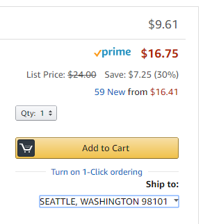
Visual hierarchy
Visual hierarchy allows visitors to identify the most important elements on a web page without having to read the content.
For example, if you have multiple calls to action on a page, make sure that the most important one is emphasized with a larger button, bolder color, or special icon.
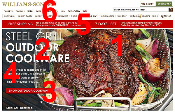
To effectively leverage the principles of visual hierarchy, you need to first determine your business objective.
What is the most important thing you want the web page to achieve?
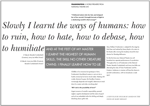
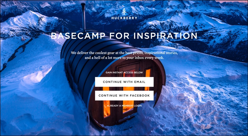
In the example below, the main goal is to create the desire for the mouth-watering piece of steak, followed by communicating what the page is about, and then a call-to-action:
Here are 6 principles you can use to establish visual hierarchy:
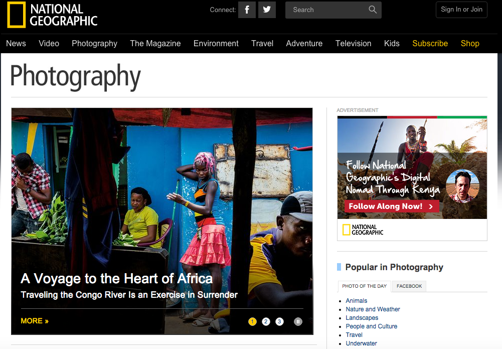
Page-scanning pattern
People tend to scan a page to decide if they want to delve deeper into the content.
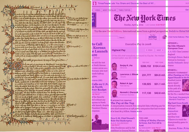
For traditional text-heavy pages, such as articles, most readers follow an F-pattern by going down the left side of a page.
They look for interesting keywords in left-aligned headings or initial topic sentences.
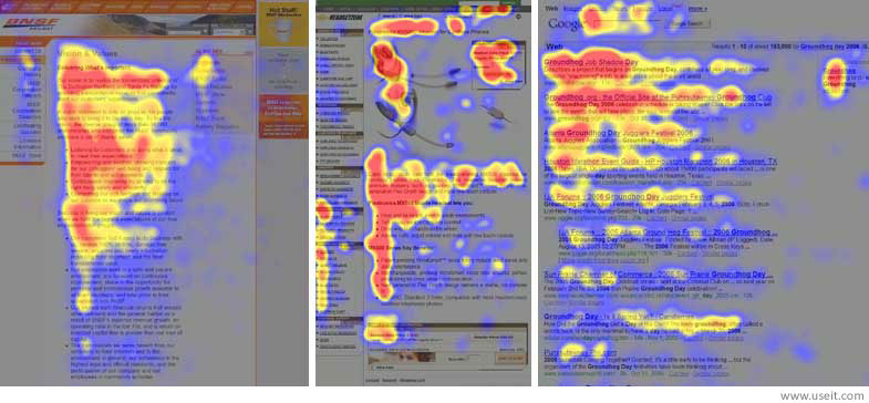
To capture your readers’ attention, place the most important information near the top left corner of a page and use left-aligned headings to pique interest.
For other layouts with less text, such as landing pages, most people scan the page following a Z-pattern:
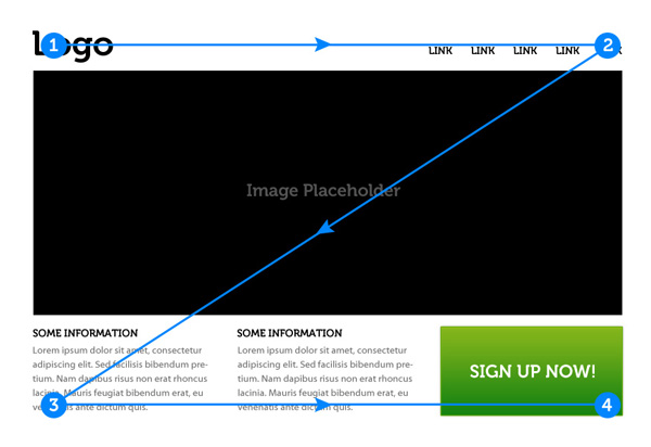
To take advantage of this behavior, place the most important information at the corners and put the rest along the top and bottom bars.
Use a visual element, such as a hero image, to connect the diagonal between the top and bottom content.

Size
People tend to read the bigger elements on a page first, so emphasize important content by making it bigger.
If the graphic treatment or color contrast is strong enough, you can often override the top-down or left-to-right reading habit and draw attention to the largest element on the page.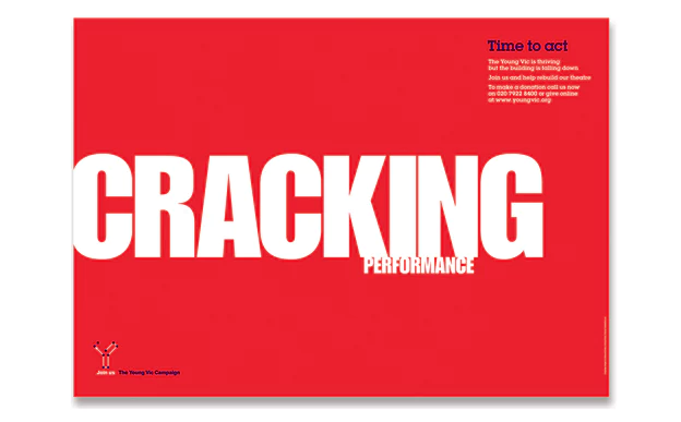
Bold color and high contrast
This one is pretty straightforward — bright and bold colors stand out and draw attention.
When put against a muted or grayscale background, bold color can deliver a striking effect:
Typeface weight and pairing
The weight of the stroke is the most important font attribute for establishing visual hierarchy.
That’s why we often use bold type to emphasize certain phrases in an article.
In addition, word placement, style (e.g. serif and sans serif), and modifications like italics and underlining also affect the visual hierarchy of the text.
Headings and subheadings
The use of headings and subheadings in an article or a text-heavy page helps create visual hierarchy.
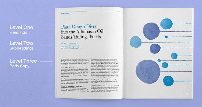
Set the style for H1, H2, and H3 tags so they’re consistent across the entire website, making it easy for visitors to understand the hierarchy of information.
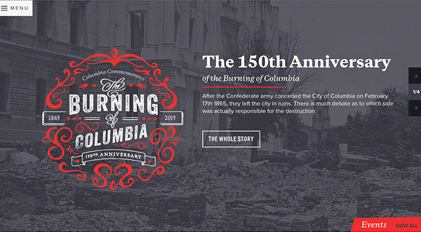
Directionality

Anything that breaks the grid, such as text that’s arranged on a curve or at a diagonal, will automatically grab viewers’ attention and become the most prominent element on the page.
Space and texture
Instead of making everything bigger and louder, you can call attention to an understated design element by putting ample space around it.
The combination of typeface, point size, tint, weight, letter spacing, line spacing, and general spatial distribution creates a holistic “texture” for a layout.
Texture and tone influence the order in which people read the text. A shaded box, for example, gives emphasis to the content inside the box and draws the reader’s attention.
White space and clean design

The use of white space and clean design is the key to eliminating clutter so visitors can quickly locate the information they’re looking for or understand the action they need to take.
White space
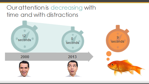
What happens when visitors run into a wall of text on a website?
Their 8-second attention spans can’t handle it, and they click away from your site.
It’s not always possible to boil everything down to three sentences, but thankfully there’s another solution.
It’s called white space.
White space is the area between design elements and the space within the design elements.
It makes your content look more digestible so your visitors will stick around.
The reduced clutter makes it easier for visitors to focus on the reason they’re on your page.
In addition, simplifying the layout and adding white space has been found to increase the conversion rates for many websites.
Despite the fact that white space is also known as “negative space,” there’s nothing negative about it.
It helps you balance design elements and organize content to improve the visual communication experience and hold the reader’s attention.
When you design with white space, consider the following:
- Legibility: Use white space to make your text more legible by considering font, size, color, style, leading, kerning, and tracking.
- Branding: Use white space to communicate your brand image. For example, a lot of negative space between design elements usually reflects minimalism and luxury. On the other hand, a lack of white space is often associated with being “informative,” as in the case of many news websites.
- Focus and attention: The white space around a design element helps you direct visitors’ attention, and it’s particularly useful for guiding them through interactive content.
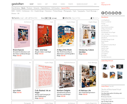
Grid system
If you have a lot of content on a page, using a grid system can help achieve a clean and organized look.
Grid systems are visual devices that have been used for centuries to give our brains a structure for understanding content on a page.
A grid system doesn’t have to be restrictive. You can break the grid to call attention to specific content, making the page design even more powerful.
Most designers like to work with grid systems with multiple columns for creating groupings that are visually exciting.
Typefaces

Today, the number of web-safe options has exploded thanks to @font-face embedding in most modern browsers.
Yet it doesn’t mean that it’s OK to throw a dozen different fonts onto the same page.
Too many typefaces on one page will make the design too busy. Your visitors won’t know where to focus their attention.
Start by choosing a display font, a serif font, and a san-serif font — this combination should meet the majority of your design needs without becoming distracting.
Assign the fonts to header tags (H1, H2, H3, and so on) so the use of typefaces is consistent across the website while allowing you to communicate the hierarchy of information.
Colors
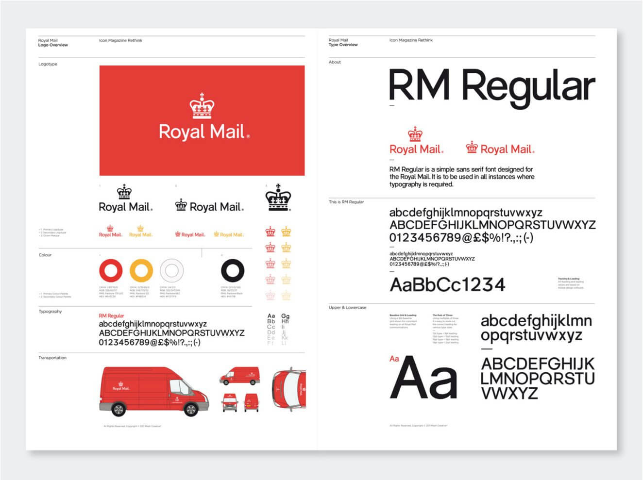
Like fonts, you should keep your palette minimal by using just to 2 or 3 main colors in your design.
Developing a brand style guide can help make sure everyone stays on the same page at all times.
Images
An animated GIF here and there may be fun, but too much movement on a page is distracting.
In general, readers prefer websites that stay still.
Be mindful about your choice of images. They should add value by communicating useful information. Don’t just use them for filling up space.
Your images should also be in alignment with the tone of the site to help deliver a consistent brand identity.
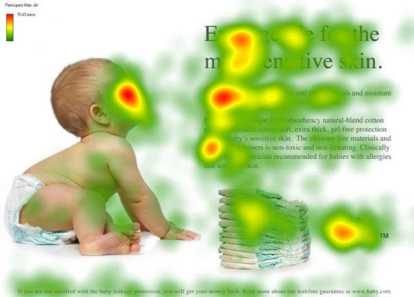
Occam’s Razor and the Pareto Principle
Occam’s Razor is the guiding principle for eliminating unnecessary elements on a page that would decrease the design’s efficiency.
The idea is that “the simplest solution is almost always the best.”
It illustrates the age-old saying that “a design isn’t finished when there is nothing more to add, but when there is nothing left to take away.”
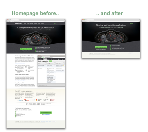
Combine Occam’s Razor with the Pareto Principle — also known as the 80/20 rule — to identify the most important elements on a page and eliminate the rest to increase the design’s effectiveness.
In the example below, the conversion rate went up by 300% after 80% of the content was removed from the page:
Accessibility
When you’re designing a website, make sure all visitors are able to access all the information quickly and easily.
Intuitive structure
Whether it’s page layout or navigation, a website needs to be intuitive to use.
That means that your visitors can find what they need and take the desired actions in the most efficient way possible.
Don’t make your visitors jump through hoops to use your website.
Typefaces
Some display fonts are eye-catching, but they’re not meant to be used for a full page of text.
For body text, stay with the tried-and-true fonts at a size that most people feel comfortable reading.
Colors
The background and text should feature contrasting colors for legibility, such as black text on a white background.
A dark text color on a light background is easier on the eye. Avoid using light-colored text on a dark background for long pieces of content.
When you’re choosing a palette, take color blindness into account to make sure that all users are able to see all design elements.
Images
93% of human communications are visual. The brain processes image 60,000 times faster than it does text.
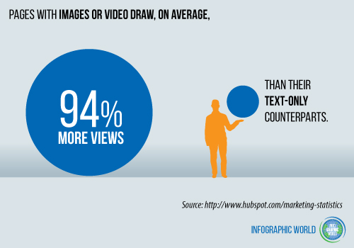
Using the right images on your website will help you improve usability and better communicate your message.
Mobile
To optimize for mobile user experience, you need to do more than squeezing all the content into a smaller screen.
Consider how all the design elements will look and play off each other when a page is viewed on mobile devices.
For example, make sure all the text is legible and the images aren’t scaled to the point where they fail to communicate your ideas effectively.
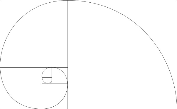
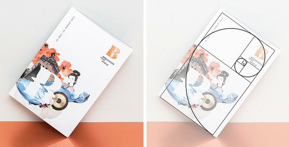
The Golden Ratio
The Golden Ratio, 1:1.618, is a mathematical ratio often found in nature.
Our brain seems to be hardwired to like objects and images that follow the Golden Ratio.
When applied to design, it often results in an organic and natural-looking composition that’s pleasing to the eye.
Layout dimensions
You can determine the dimension of different elements on a page using the Golden Ratio.
For instance, when you divide the typical width of a webpage (960 pixels) by 1.618, you get 594 pixels. Many websites use that as page height.
It’s also popular for sites to set the width of a two-column layout based on the Golden Ratio:
Spacing
It’s often tricky to determine the ideal spacing between design elements.
Make your life easier by starting with the Golden Ratio diagram and use the squares to guide the placement of text and images.
Content placement
Do you want to make sure that your visitors are reading the content on your page?
The eye likes to trace the Golden Spiral, so if you place the content along the spiral, it’s more likely to get read.
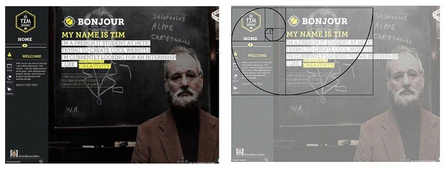
Rule of thirds
The Golden Ratio can also inform composition, whether it’s a photo or a page layout.
A simplified way to use the Golden Ratio for composition is to follow the Rule of Thirds.
If you divide a web page into 9 equal parts with two horizontal and two vertical lines, your visitors’ attention will most likely be drawn to the intersections of the lines:
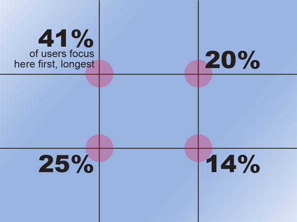
The top left intersection tends to draw the most attention, making it the ideal location for the important information.
Gestalt Design Laws
Gestalt is a form of psychology based on cognitive behaviors.
The word “gestalt” means “unified whole.” It captures how we perceive, process, and piece together fragmented parts.
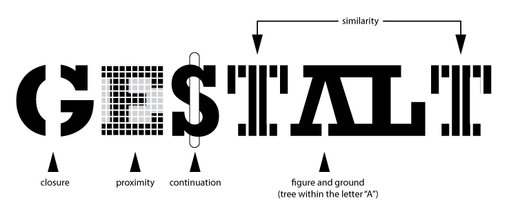
When applied to design and visual perception, gestalt refers to how the mind copes with a large amount of visual input from our everyday lives.
We tend to discern relationships among design elements and consolidate objects into groups to simplify input.
When leveraged properly, these relationships and groupings allow us to create a better user experience and communicate a message more effectively.
Here are the design principles derived from the Gestalt theory:
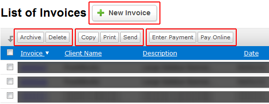
Proximity
When objects are grouped together close in space, they tend to get perceived as one object.
The distance between objects on a page determines whether they’re perceived as a group.
Improve usability by putting elements of the same category close together, such as navigation or footer links, to show that they’re all parts of the same function.
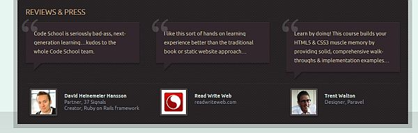
Similarity
Shared visual characteristics create relationships. If two items look alike, they’re perceived to be in the same group.
In website design, you can use visual treatments to communicate the function or category of a piece of content.
For example, when all testimonials share the same design treatment, visitors will perceive them to belong to the same category even when they’re scattered across the site.
Continuity
Once the eye starts following something, it’ll continue traveling in that direction until it comes across another object.
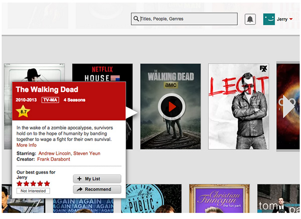
Many conversion-focused websites leverage this cognitive habit by using photographs of models whose gaze is directed at the content or call-to-action on a page:
Closure
The brain seeks completeness, so when we see shapes or images that aren’t complete, it’ll fill in the blanks.
The law of closure can be used to make a visual design more interesting. It works best on objects that are common and recognizable by the audience.

Symmetry
The brain seeks out symmetrical arrangements.
When we see two unconnected but symmetrical elements, our mind will put them together to form a coherent shape.
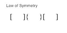
A symmetrical arrangement of elements on a page helps create a visual unity that’s pleasing to the eye.
Common fate
We group together objects that show the same directionality.
For example, when you have a group of people gesturing in the same direction, they’re perceived as a group.
Just like the gaze of a model used in the law of continuity, you can leverage this cognitive behavior to draw attention to content, logos, or calls to action.

Hick’s Law
Every choice that you make available to website visitors increases the amount of time required to make a decision.
This principle is related to the Paradox of Choice, which states that when you give people too many choices, many of them won’t choose anything at all.
Hick’s law can help improve your website’s usability and increase conversion rates:
Minimize choices
On conversion-focused designs, such as landing pages, minimize the number of choices to make taking the desired action a no-brainer.
For example, most landing pages feature a hero image, concise text, and one prominent call to action to make it clear what the visitors are expected to do.
Navigation
If you put a link to every single page on your website in the navigation bar, it’s going to look chaotic and overwhelming.
Visitors will get confused, and the confused mind says, “No!”
Design your website menu to show only high-level categories. Slowly drill down as the user goes deeper into the site.
Search function and filter
To help visitors find specific items or information without throwing everything into the website navigation, you need a robust search function.
If you have a large product selection, even the search results can be overwhelming.
Design an easy-to-use filter feature to help visitors further limit the number of choices being displayed so they can see the most relevant results.
Fitt’s Law
Fitt’s law states that the time required to move to a target area, such as a button, is a function of the size of the target and the distance to the target.
Use this design principle to get visitors to click on a call to action faster:
Size and placement
Increase the likelihood of visitors clicking on a button by putting it in the most accessible area of the screen, where the eye typically falls, or where the mouse already is hovering.
Often, you can increase a button’s prominence by making it larger or using a bold color.
However, bigger is not always better. An increase in button size doesn’t linearly increase the web page’s usability.
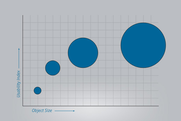
In addition, the size and prominence of a button should reflect its expected frequency of use to help the majority of your visitors take the desired action.
Distance and movement
The other primary factor of Fitt’s law is the distance between where the mouse pointer currently is and where it needs to be.
That means that it will take visitors longer to complete a sequential task if key elements are farther apart.
To make sure that more visitors are completing a task, group the links required to do so in close proximity.
Conclusion
Your website design needs to be both aesthetically pleasing and financially rewarding.
Fortunately, science-backed psychology can help us design more appealing and more user-friendly websites.
Following the principles described above can help you increase conversion rates and reduce bounce rates.
They can also help you guide your website visitors toward a desired next step in the conversion process.
Even if a design is pretty, it might not be useful. Keep that in mind when designing your website.
Additionally, don’t be afraid to experiment with and text different graphic elements as well as your copy. Figure out what pleases your target audience.
Run A/B tests on single elements to determine whether the change makes a difference.
These universal design principles are good checkpoints to make sure you always keep your business objectives in mind as you design a website.
How do you use these design principles on your website to improve usability and conversion?
The post Universal Web Design Principles That Improve Usability And Conversion appeared first on Neil Patel.


Comments
Post a Comment