How to Design Your Ecommerce Store to Boost Conversion
How many times have you landed on an ecommerce site only to click away?
Not because it doesn’t have the product you need, but because it’s so confusing?
I have. Many times.
After being in this business for so many years, I can probably find my way around these sites.
But heck, there’s no reason to jump through the hoops when I can find the product I want somewhere else.
Like the average consumer, I want a convenient shopping experience and to buy from a brand I like and trust.
Many of the factors that affect conversion — from making sure information is easy to find, to communicating a trustworthy brand image — are related to how your ecommerce site is designed.
Website design is more than just pretty pictures.
All the visual elements need to work together to deliver an outstanding user experience that’ll lead to higher conversion rates, more sales, and more returning customers.
Here’s how to design your ecommerce store to boost conversion.
Use high-quality product images
The inability to deliver a tactile experience is one of the biggest challenges for ecommerce merchants.
Since customers can’t touch your products, you have to make the most out of the two-dimensional screen to communicate the features and attributes of your products.
There’s no doubt using images can increase your conversion rate. But the amount of the increase depends on what images you use and how you use them.

Image size
Bigger is not always better when it comes to product images.
A study conducted by ConversionXL Institute found that people respond to image sizes differently for different types of products.
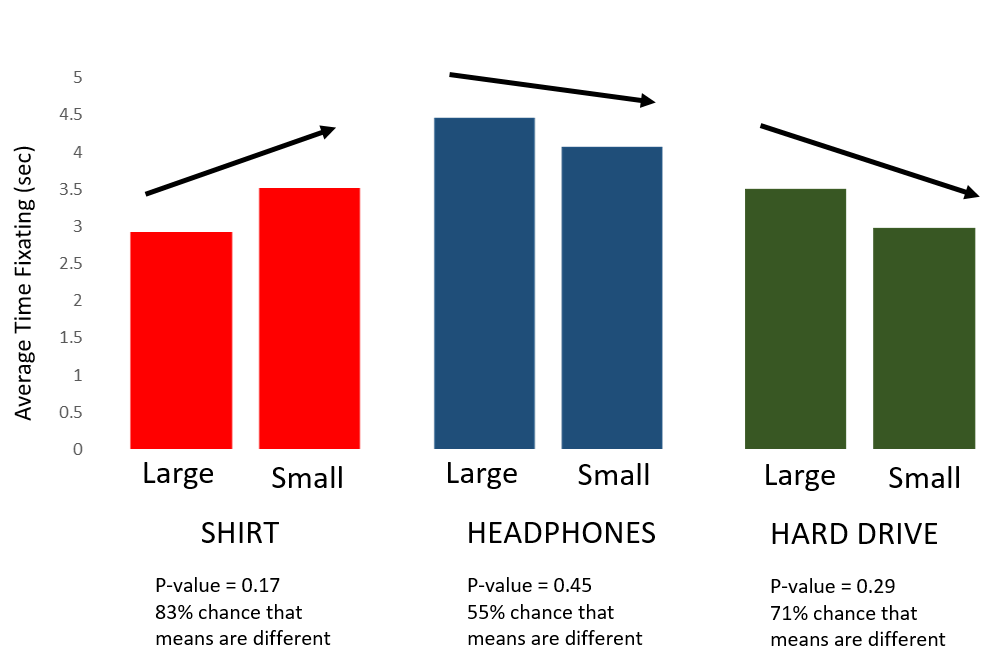
The study compared the effects of different image sizes for a dress shirt and a hard drive.
It found that people tend to view experience goods (e.g. a dress shirt) as less valuable when a larger image was used and consider search goods (e.g. a hard drive) more expensive when a large image was used.
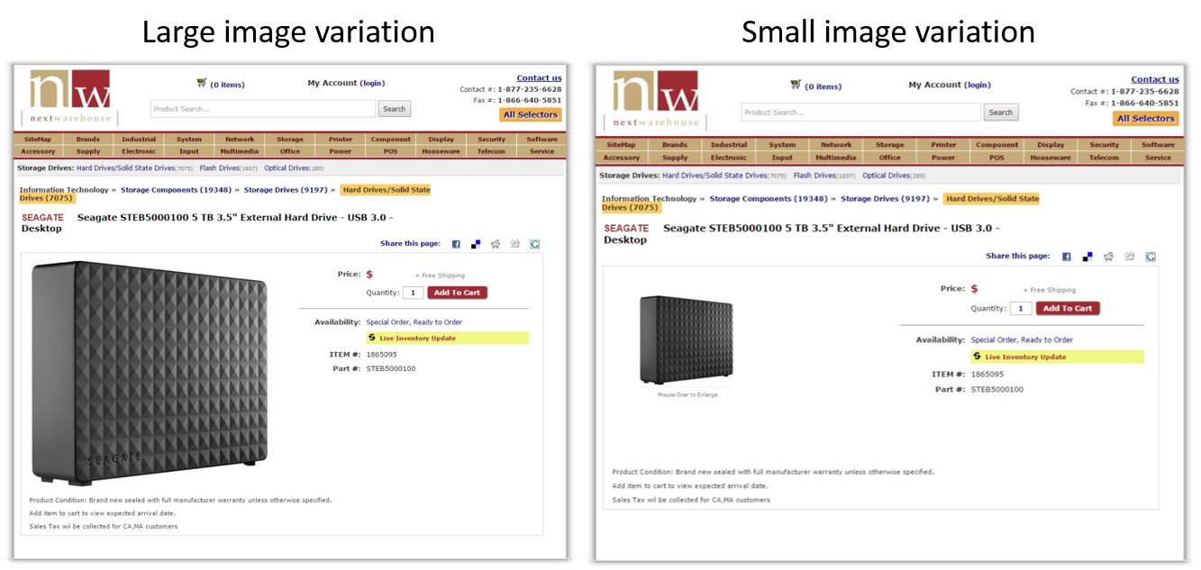
Make an assumption based on your product type, and then do some A/B tests to determine the optimal size for your product images.
Image quality
The images you use on your product pages need to be of high quality. Each should be carefully staged and taken with proper lighting.
Before you upload the images to a product page, make sure they’re optimized.
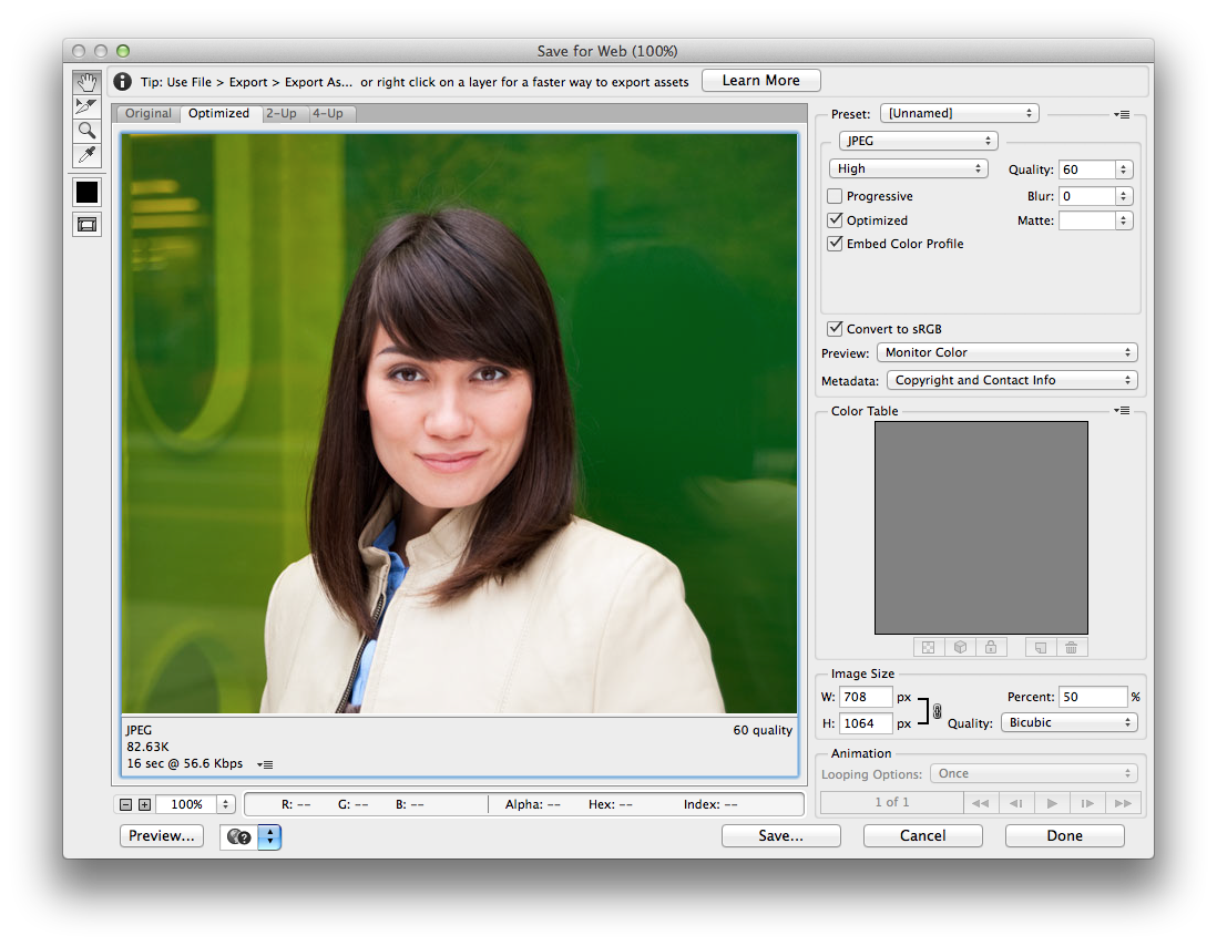
The file size should be large enough so the image doesn’t look blurry, while small enough so it doesn’t slow down load time. Slow load time could affect the search engine ranking of the page.
Zoom feature
Use a zoom function to show details and texture of your products.
This not only will allow your visitors to see the details of the products but also give them the confidence to purchase from your store by knowing that your products are of high quality.
Optimize images properly, so they look good even when enlarged without impacting load time and user experience.
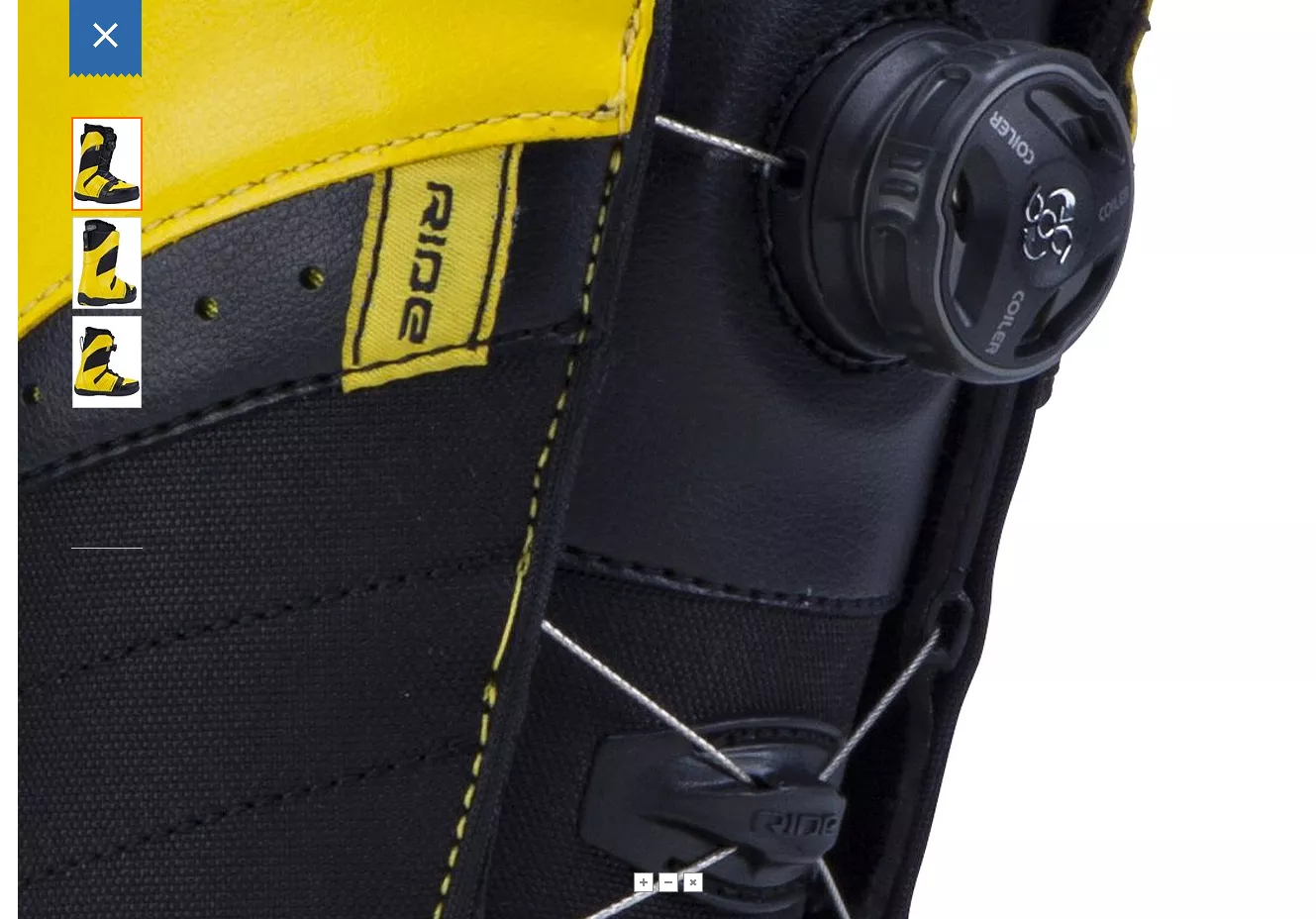
360-degree view
Show images of a product from different angles and at different levels of detail.
A well-curated set of images will help you showcase the various aspects of a product to deliver the experience of holding and examining it in a store.
You can also use dynamic image technology that allows your visitors to spin the images around.
The rotating images have been found to outperform the static ones and increased conversion rate by 27% for this website:
Show context
Images that show your products in action help your visitors imagine themselves using and enjoying the benefits of your products.

Emotional and visceral appeal
Many purchasing decisions are driven by emotional reasons, so your images need to be relatable and communicate the positive emotions your customers want to get out of using your products.
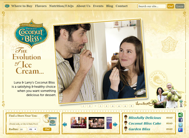
People develop powerful and visceral reactions to images, so it’s important to know your audience to help you select the images that inspire and engage your customers.
The image above from the Coconut Bliss website has done a few things right.

Avoid bad stock photos
Using cheesy stock photos can make you appear disingenuous, erode the trust customers have in your brand and turn visitors away from your website.
All your photos should look real and authentic. A model dressed in a suit giving your visitors a thumbs up could do more harm than good.
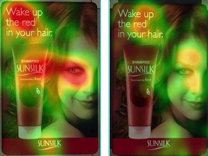
If you use a stock photo of a person, consider how it affects the trustworthiness of your site and how the faces draw attention from other elements on the page.
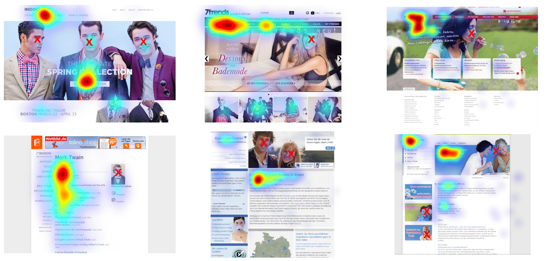
An eye-tracking study found that people tend to follow the gaze of the model in a photo. Make sure the model is looking at the element you want to emphasize, such as a product photo or the call to action.
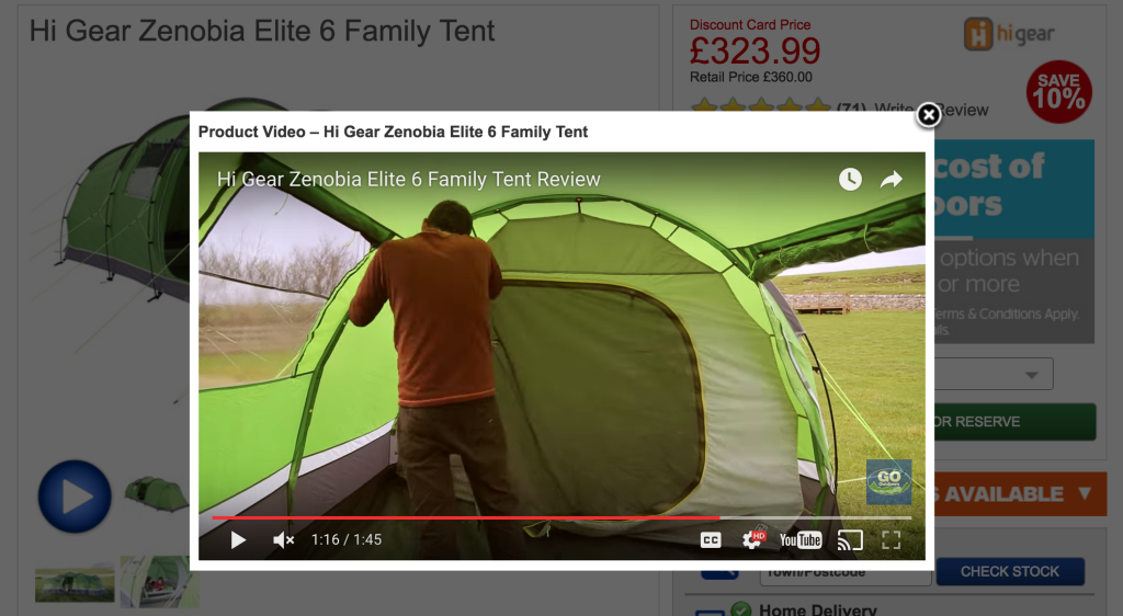
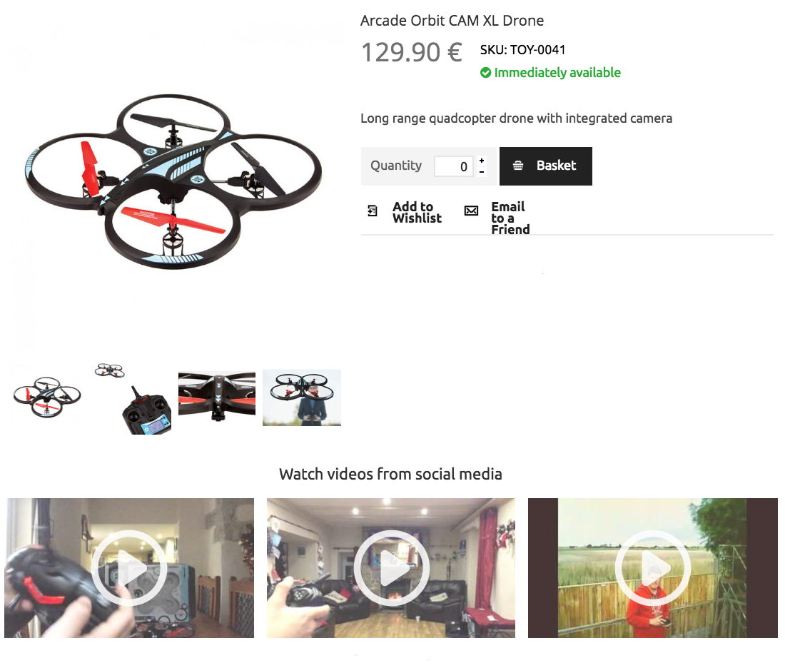
Incorporate product videos
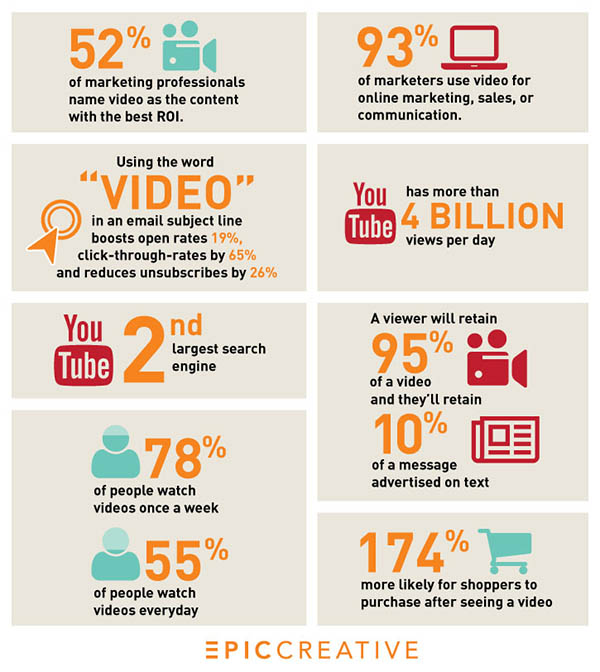
The question is no longer “Should I use video on my eCommerce store?” but “How can I get the most out of the videos?”
The fact that videos help boost conversion rates is undeniable.
You can incorporate videos on a landing page to build excitement or on a product page to provide visitors with additional details about the product.
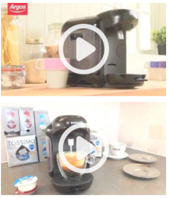
To draw attention to the videos on your product pages, include thumbnails with a play button icon.
The length of your videos also determines how effective they are.
They should be long enough to provide useful information yet short enough so visitors will watch them in their entirety.
Wistia has found that videos up to 2 minutes long get the most engagement. While there’s a significant dropoff between minutes 2 to 3, viewers who stay tend to stick it out between minutes 6 to 12.
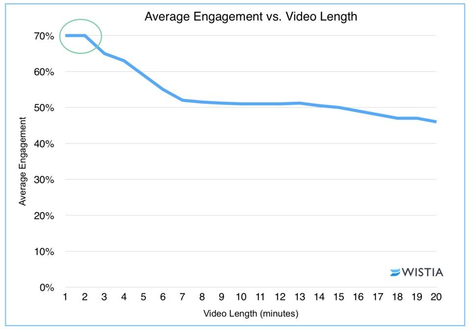
For most product videos, a duration of under 2 minutes will deliver the highest impact.
In fact, the shorter the better.
Keep in mind the average Internet user has an attention span of just 8.25 seconds, so the first few seconds are critical in capturing your viewer’s attention.

Product demo
Video is the ideal medium to show your products in action, and it has helped many retailers increase conversion rate.
The online retailer Simply Hike has used demo videos to increase conversion rates by as much as 25%.
Use a model your ideal customers can identify with, so they can imagine themselves enjoying your product while learning how to use the different features to get the most out of their purchase.
Alternatively, you can involve influencers whom your audience regards as authorities to talk about your product.
How-to videos
It’s not uncommon that consumers shy away from making a purchase because they aren’t sure how to use a product.
A how-to video offers step-by-step instruction and is suitable for products with complex features and an audience that is eager and detail-oriented.
It’s also a great opportunity to show how the product works in context to help shoppers visualize how they can use the product in their lives.
Comparison video
Sometimes consumers aren’t making a purchase because they have too many choices, and they’re stuck in analysis paralysis.
An unbiased comparison video that puts your product side-by-side with your competitors will help your audience understand how the products differ from each other and what they should consider when making a decision.
Product reviews and user-generated video
It says a lot about your brand and products if your loyal customers are so satisfied with their experience that they’re willing to take a few moments to record a video about their purchase or show how it works.
Reviewers can talk about how they use the product, which features or functions they find most useful, how their lives have improved with it, and more.
When potential buyers see that “people just like them” are getting great results from your products, they’re more likely to make a purchase.
Follow web design best practices

You need to work with how the brain perceives visual elements and processes visual information to make the purchasing experience as frictionless as possible.
Here are some tried-and-true website design best practices:
Consistent palette and typeface
Brand style guides are developed for a reason: to maintain a coherent user experience and visual identity that consumers will instinctively associate with your brand.
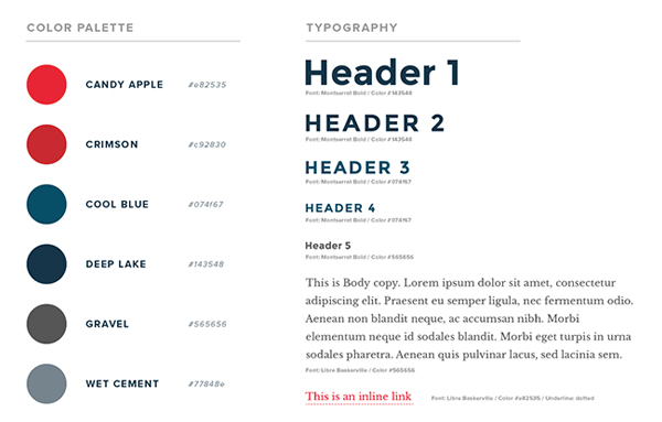
The style guide isn’t just a document to stow away after a branding exercise. It helps you communicate a consistent image.
Consistency breeds trust and trust leads to conversion.
Not only should you maintain a unified visual identity throughout your website, but you should also extend it to other online and offline marketing materials, such as Facebook ads or postcards.
This will ensure a coherent user experience throughout the entire customer journey.
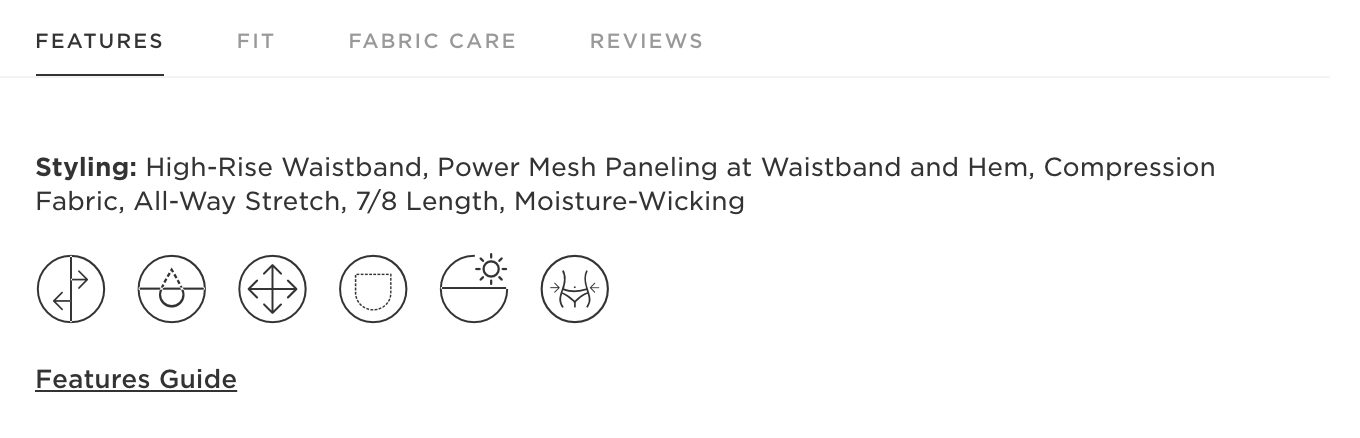
Clutter-free layout
A minimalist design approach helps remove any unnecessary element or distraction on a page, so only those elements vital to driving conversion remain.
You can also create a clean layout by keeping the elements aligned with each other in a grid structure.
If you need to display a good amount of information, use a series of tabs to help organize the copy and reduce clutter.
Here’s how Fabletics does it with their product descriptions:
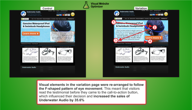
Visual hierarchy
Establishing a visual hierarchy is more than just making something bigger and brighter to catch the user’s attention.
To guide the placement of the content and graphic elements, take into account how our brains process information.
In most Western cultures, we read from left to right and top to bottom. Our eye movement follows an F- or Z-shaped pattern as we go down a page.
The organization of your content should follow this pattern, so visitors will be reading it in the intended sequence.
By rearranging the visual elements to follow an F-/Z-pattern, Underwater Audio increased sales by 35.6%.
Urgency
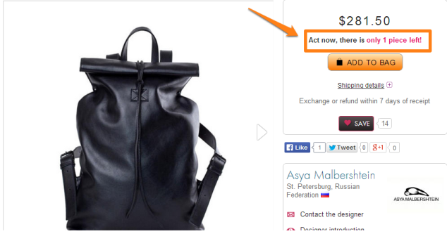
We all know that applying urgency helps increase conversion rates. Make sure you include design elements to draw attention and increase the sense of urgency.
You can do so by calling out products with low stock (“only 2 left”), time-bound purchase for next-day shipping (“want it tomorrow? Order within xx hours”), limited-time offer (“discount valid till”), or limited-time free shipping.
Pre-sale customer care
Some of your potential customers may be very close to making a purchase, but they have some lingering questions.
If you can answer those questions right away, you’ll push them over the fence.
Making pre-sale customer care easily accessible can help you turn these prospects into buyers.
The link to contact customer support should be a persistent element on all your pages, prominently displayed and inviting.
If you have live chat on your site (and you should!), incorporate it into the design, so it’s easy to spot without being intrusive.
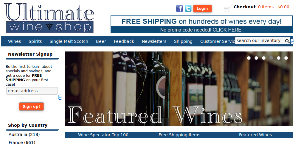
Free shipping
A free shipping offer has been found to boost conversion rate, increase average order value, and improve customer loyalty.
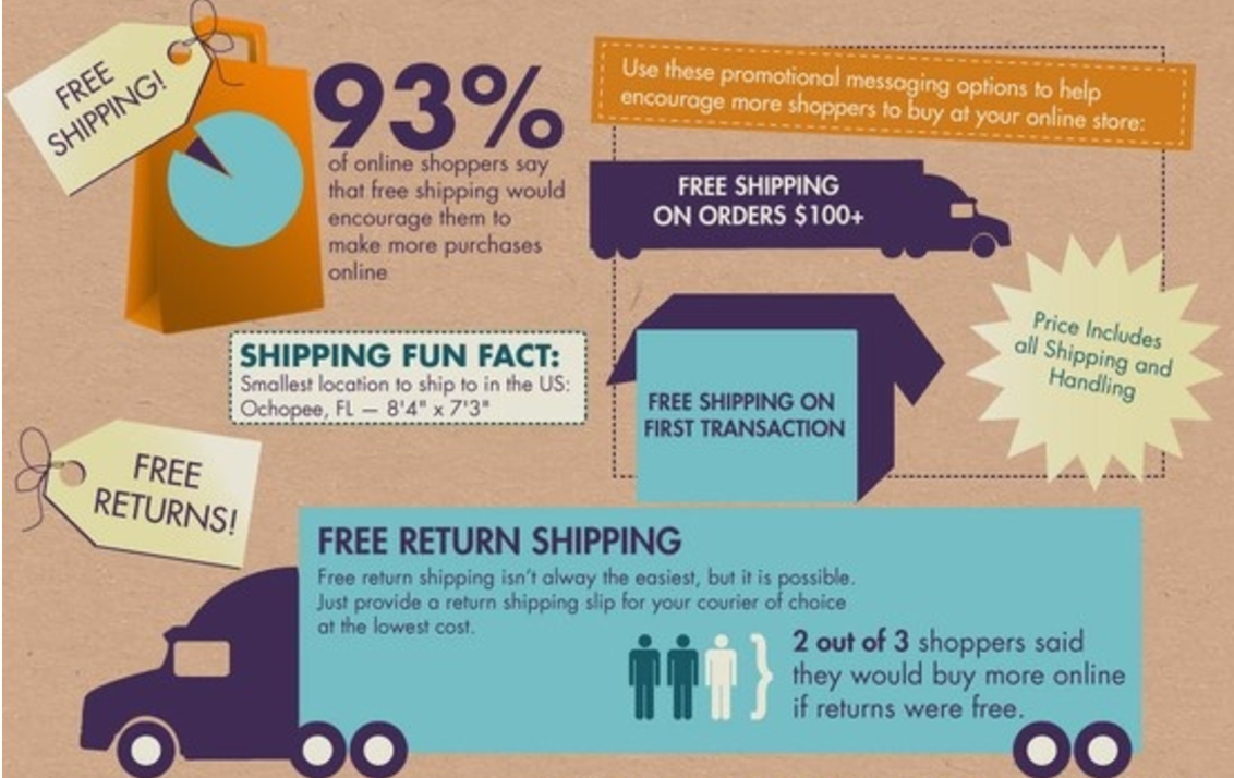
Use design elements throughout your website to highlight your free shipping offer.
You can also include a dynamic element that calculates how much more your customers need to add to their cart in order to qualify for free shipping (“you’re $8.95 away from getting free shipping!”).
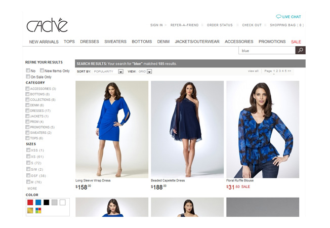
Search function
Your visitors are much more likely to make a purchase if they can find what they need quickly.
For many customers, your search box is the beginning of their purchasing path, so make sure they can easily locate it on your website.
Most websites put their search boxes in the upper right corner, and that’s where users are most likely to look.
Make your search bar more noticeable by using a contrasting color and having it long enough to show instructional text, such as “Enter keyword or item #.”
Adding product images to the site search window can also help increase conversion rates.
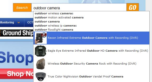
In addition, display your search results in a way that helps your customers find what they need. Include a filtering feature so customers can quickly sort through the results.
Call to action
If your visitors can’t find the “buy now” button, you aren’t getting any conversions.
Your call-to-action button needs to stand out, so visitors can easily distinguish it from other elements on the page.
Here are some tips on how to do that:
- Use a contrasting color.
- Experiment with button shapes.
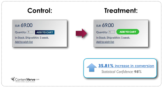
- Make sure the call-to-action text is legible on all devices.
- Keep the text short, punchy, and action-oriented.
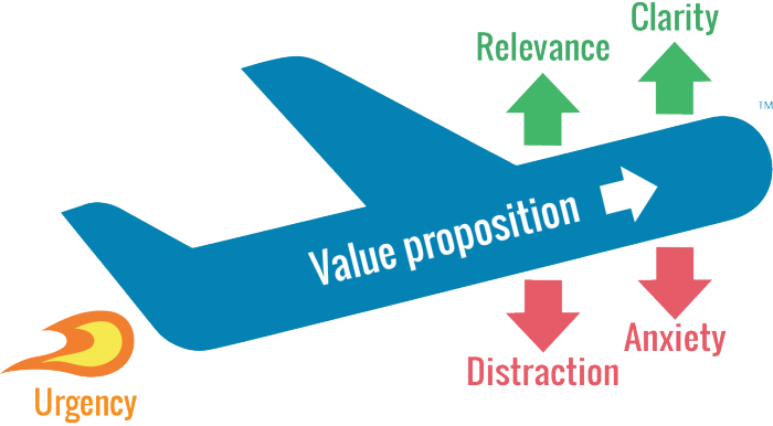
- Use the copy to reinforce your value proposition.
- Put the CTA above the fold.
- Place multiple CTA buttons on the page, so customers don’t have to scroll up and down to look for them.
- Make sure the button looks clickable. I’m seeing many “minimalist” sites that are beautifully designed, but the CTA buttons are so minimalistic that nobody can find them!
Mobile optimization
Google reports that 90% of people who own multiple types of devices switch between screens when completing a task.
Your ecommerce site needs to be mobile optimized to deliver an easy-to-use interface and consistent user experience across devices.
Consider how the desktop layout translates onto the small screens, how the most important elements are highlighted on a page, and how the navigation works on mobile.
Do this so visitors can find what they need quickly and easily. If they can’t find a product, they can’t buy it!
Slideshow or carousel
An image slider or carousel is a big no-no, according to many conversion experts.
It takes the attention away from the most important element on the site while confusing your visitors with too many messages.
Not to mention, it often triggers “banner blindness” that causes your visitors to skip over the information altogether.
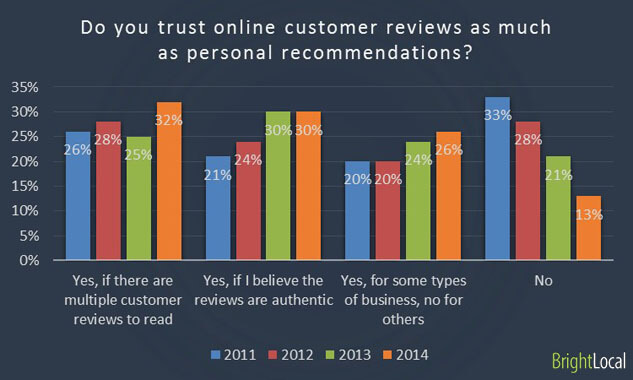
Make the most out of customer reviews
A study has found that 88% of consumers say they trust online reviews as much as personal recommendations.
This online retailer increased sales by 58.29% after adding customer reviews on its product pages.
Make the ratings more helpful by including different aspects of the products. For example, many clothing retailers break down the ratings into design, quality, comfort, and fit.
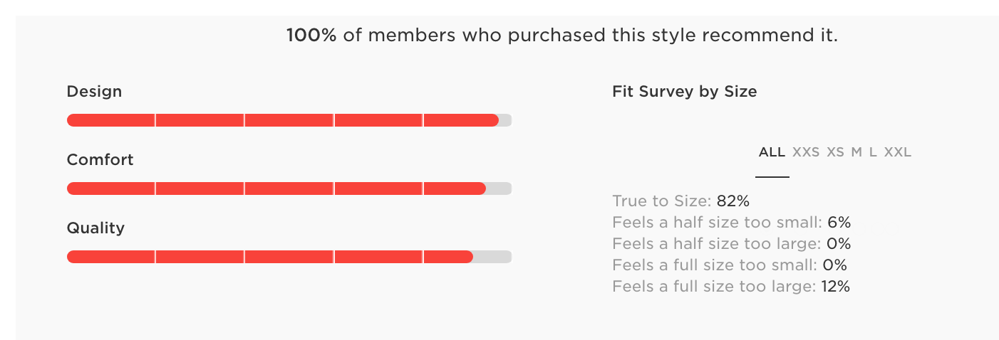
In addition, showing details of the order (color, size, etc.) and marking it as a “verified purchase” next to a customer review helps increase credibility.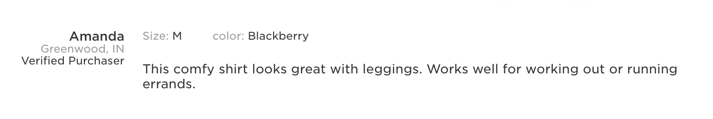
Collect high-quality reviews that show a balance of pros and cons, indicate how the reviewers use the product, and compare the product to competing brands.
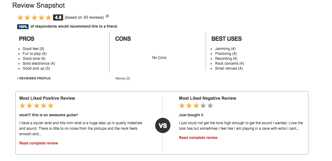
You can design a “review snapshot” to help customers find the most helpful reviews:
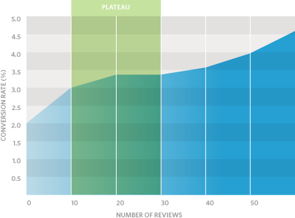
The number of reviews also matters. After analyzing over 1 million product page visits, Reevoo found that conversion rate increased by 18% when the number of reviews displayed went from 25 to 50.
Don’t lose them at checkout
Your potential buyers have made it to checkout. Congrats!
However, don’t celebrate too soon.
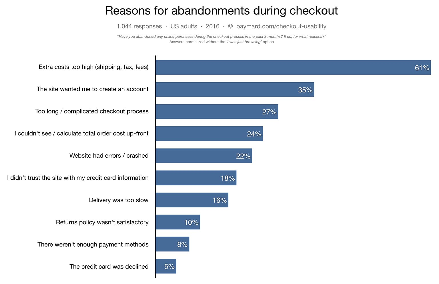
According to Baymard Institute, 58.6% of US online shoppers have abandoned a cart in the last 3 months due to a variety of reasons.
Further, Baymard Institute’s research has shown that the average large-sized ecommerce site can gain a 35.26% increase in conversion rate through better checkout design.
- Reduce the number of steps or clicks required to complete the checkout process. You can A/B test a single-page checkout against a multi-page checkout process to see what works best for your audience.
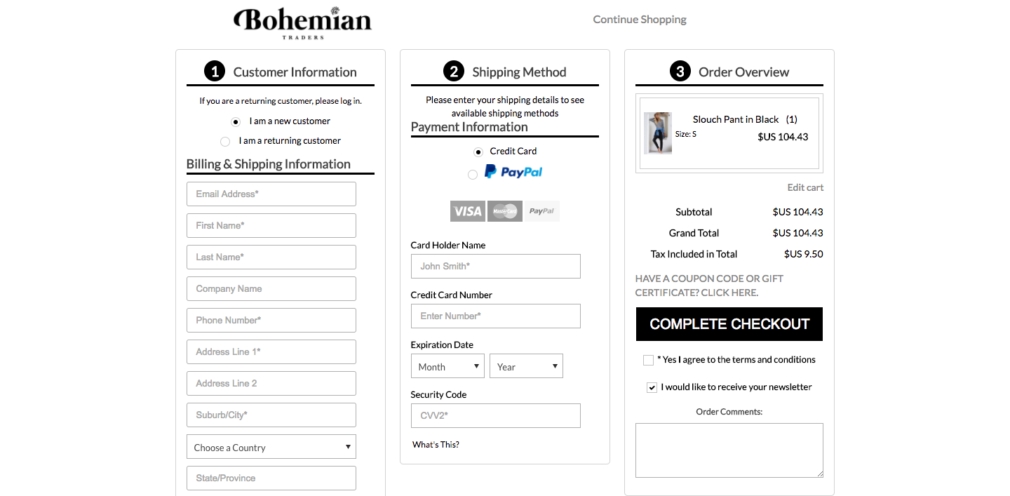
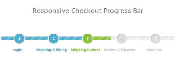
- If checkout involves multiple pages, show a progress bar.
- Allow buyers to check out as “guest,” and create an account after they have completed the purchase.
- Include links to privacy policy, shipping details, FAQ, and returns policy without requiring customers to leave the checkout flow. You could display the information as a popup.
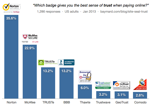
- Include credit card logos and trust seals next to payment information fields.
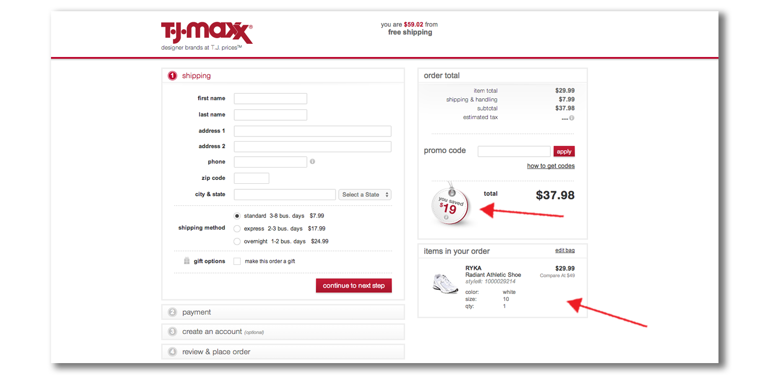
- Clearly show the final price and the breakdown, such as tax and shipping, before the customer completes the order.
- Place the coupon code box where customers can easily see it.
- Offer a variety of payment methods, and show the logos or icons. For example, if you accept PayPal, include a PayPal badge.
- Use graphic treatment to reiterate and highlight the amount of savings of the purchase.
Conclusion
There are many ways to design an ecommerce website to optimize conversion.
However, you don’t have to throw in everything and the kitchen sink to make your site work.
Design your site so it communicates your brand image and puts your products in the best light possible.
And remember, your ecommerce store is about the customer, so always prioritize the user experience.
Any time you make a change, don’t forget to review the metrics to make sure it’s helping you move the needle in the right direction.
What have you done to increase conversion on your ecommerce store? What has been working well for you?
The post How to Design Your Ecommerce Store to Boost Conversion appeared first on Neil Patel.


Its a great pleasure reading this post. Want to share with another idea, like 3d rendering the products with white background.
ReplyDeletefurniture with white background