How to Create a Mobile Version of Your Online Store That Converts
There are more people than ever moving through their daily lives with a mobile device at the ready.
According to the Pew Research Center, we’ve gone from around 62% of consumers with mobile devices in 2002 to 95% as of November 2016 (77% with devices classified as smartphones).
Despite a significant uptick in mobile use, as well as upward trends in online shopping, online stores are still struggling to get mobile users to convert.
But if more have a mobile connection and more consumers are shopping online, why are mobile conversions so bad?
The answer is in the user experience.
A poorly optimized digital experience is the root cause of the difference in average desktop conversion rate (4.14% in Q4 2016) and average smartphone conversion rate (1.55% in Q4 2016).
With limited screen size and evolving purchase habits, consumers are far less likely to tolerate a challenging navigation and checkout process.
Those sites that take the time to optimize for the mobile experience see 2 times the mobile conversions.
As well as consistently higher sales from mobile customers.
There’s no greater proof that without a mobile optimized shopping experience you’re leaving money on the table.
Especially when you consider that more than half of Internet traffic comes from mobile devices.
To capture more of that traffic and convert those customers, you need to improve the mobile experience.
Here’s how to do that.
Always focus on the value proposition
Your visitors aren’t just measuring the product when they come to your online store.
They’re sizing up your brand, and their first impression takes place in a fraction of a second.
Aside from looking for a solution to a particular problem or checking your products, the visitor also wants to know deep down why they should do business with you.
That’s your value proposition.
It’s a statement that sets you apart from your competitors and is used to convince the visitor to buy from you.
It’s concise and can set the hook as soon as they land on your site. Look at the landing page for Dropbox and the clear value proposition.

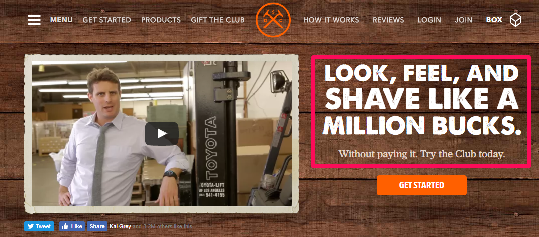
And here’s an example from the ecommerce side. Dollar Shave Club makes a clear statement about the quality of its product, the comparison to competitors, and the savings all in one concise value proposition.
Set that hook as soon as mobile visitors land so they know what you offer and what they’re missing out on if they don’t stick with you.

Lead user navigation with visuals
Visually, there’s a lot going on when a visitor arrives at your online store.
There are images, calls to action, text, trust signals, benefit statements, descriptions, and more pulling at their attention.
On top of that, their mobile device is regularly receiving notifications that can interrupt their attention.
Enhance the user experience and pull them into your funnel by leveraging the visuals of your site.
This is where Fitts’s law comes in handy.
In short, the larger the object is, the more likely your eye (and attention) will be drawn to it. For your online store, that means they’re more likely to click and interact. This is also known as “visual weight” among design principles.
With that in mind, part of optimizing your site for mobile is using larger text and graphics for communicating next steps, important information, and calls to action.
Look at how GameStop adds visual weight to draw the visitor’s eye on its homepage.
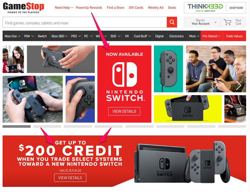
It’s common advice to recommend bold and contrasting colors for a call to action, but you can apply the same approach to other visual elements to guide your visitors and focus their attention.
Make navigation easy to understand
With the limited real estate on smaller mobile screens, tablets included, a responsive design isn’t always enough.
Every word counts when communicating with customers.
If the text you use in your navigation menu isn’t crystal clear, it can lead to confusion, making it difficult for the customer to take action.
Unless their drive for your product is extremely high, there’s a good chance they’ll give up quickly.
Research your customers so you can use the most appropriate language to make your navigation easy to understand.
Simplify navigation to minimize clicks

This is echoed with mobile optimization to ensure that navigation on a touchscreen is easy and feels like second nature.
This can be done in a number of ways such as:
- Grouping options together
- Organizing similar pages into a single page
- Prominently featuring important pages
- Dividing navigation into subcategories
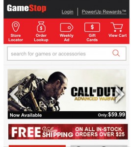
I’ll pull GameStop in for another great example of using visual navigation rather than plain text or simple buttons to make navigation easier.
With that in mind, one thing you want to avoid is minimizing clicks just for the sake of shortening the funnel.
Minimizing taps is a smart approach in mobile conversion, but only if the customer has decided what they want to buy.
Don’t try to optimize your mobile site at the expense of the shopping experience.
You don’t want to force the user into a quick purchase decision.
According to ConversionXL, the best results come when your mobile optimization is done with the buyer’s journey in mind. Exploration should be easy and seamless.
Then, when the customer is ready to start a purchase, the path to the checkout is minimal.
Optimize everything for the customer’s search experience
Easy navigation is critical, but so is making it easy for customers to find exactly what they’re looking for.
You have two kinds of customers in your online store:
- Those who know what they’re looking for
- Those who are browsing for something, but don’t know what
The search bar should be prominent in your online store and easily accessible on arrival.
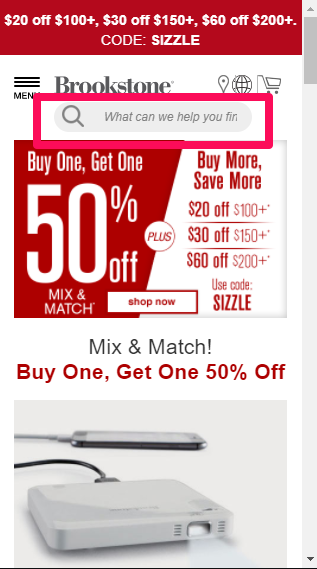
Brookstone places a labeled search bar right at the top near the logo and navigation.
But having a search bar isn’t enough.
You need to draw attention. Label your search bar using visual cues that draw the eye. A phrase like “What are you looking for today?” works well.
One thing to keep in mind is how your visitors are searching for products.

Unfortunately, 94% of the mobile ecommerce sites being viewed didn’t support this function and were returning site-wide searches instead.
That can return an overwhelming number of results leading to customer frustration.
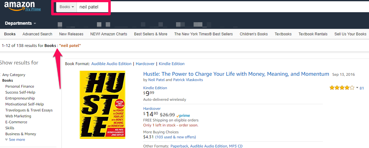
A great example of in-category search is the way Amazon handles visitor search queries.
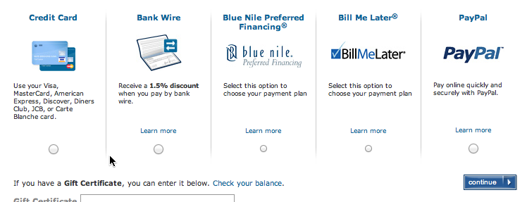
Give them multiple payment options
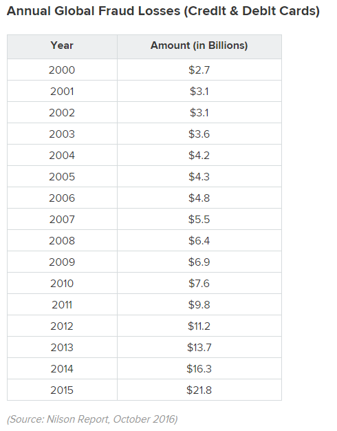
With a surge in online spending comes the potential for fraud, and every year the annual global loss via credit and debit card fraud has continued to climb.
Data from a 2016 Nilson Report, shared by WalletHub, shows a dramatic change between the year 2000 ($2.7 billion in losses) and 2015 ($21.8 billion in losses).
That kind of fraud increase puts consumers on edge about sharing payment information. It also increases their reluctance to make purchases on a mobile device.
Offering multiple safe payment options can ease the tension, especially if you add payment integrations that don’t rely on credit cards.
There are numerous secure payment integrations to choose from, including:
- Samsung Pay
- Apple Pay
- Amazon Pay
- PayPal
- Google Wallet
As an added bonus, adding more ways to pay may improve conversion rates in ecommerce.
Multiple payment options can greatly improve convenience for the mobile shopper.
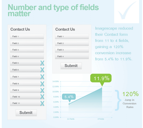
Reduce friction with simple forms
The minimal screen space of mobile devices can turn filling out forms into a serious chore.
Customers expect to have to fill in some information when shopping online (shipping and billing info), but the more form fields you require to get through checkout, the greater the friction.
When it comes to mobile optimization, less is more. Remove unnecessary fields.
ImageScape was able to improve its conversion rate by 120% by limiting the number of fields on its contact form.
That’s a little harder to do in ecommerce, but there are some simple tricks to streamline the form field process:
- Auto-fill user data.
- Auto-advance users to the next segment when fields are completed.
- Port information to save repeat entry (use shipping info for billing info).
- Customize key entry. If it’s a name field, use letters. For numeric spaces, bring up a number pad.
Use sticky CTA buttons
When your customer is ready to make a purchase on mobile, you want to get them there quickly.
Sticky buttons can keep those “add to cart” and “checkout” buttons front and center on mobile. Here’s an example of a sticky CTA in action on the Apple website:
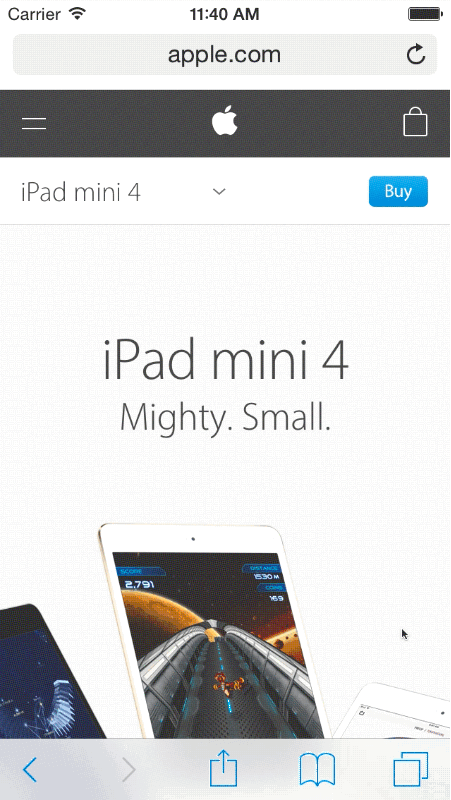
No matter how the user navigates and scrolls, the call to action (CTA) buttons remain visible, ready to take them to the next step in the funnel.
Make site speed a priority
If you only have a fraction of a second to set the hook when a visitor comes to your online store, how patient do you think they’ll be waiting for your store to load?
You’ve got about three seconds of load time before the average customer will bounce and search elsewhere.
That’s not much of a worry for a strong broadband connection at home. But when signals can degrade on mobile, it can have a huge impact on conversions.
And an even bigger impact on your revenue.
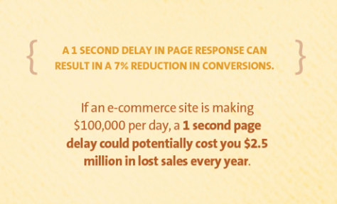
Consider this basic math: If your ecommerce site is making $100k per day in revenue, a delay of just one second in load time could result in as much as $2.5 million in lost sales annually.
If you’re not sure how to check load time to improve your mobile loading speed, use Google’s Speed Test.
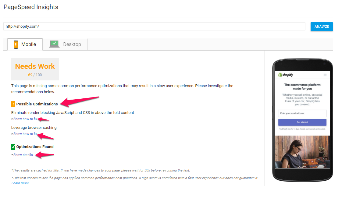
This performance test will check your site’s mobile load time and provide insights and suggested fixes to let you know where your store is stalling.
Optimize landing pages for mobile
Over 75% of consumers prefer to get notifications and permission-based promos via email over any other medium.
What does that have to do with mobile?
A lot.
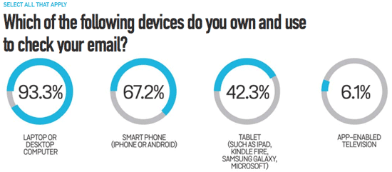
Because 67% of consumers use their smartphone to check their email.
That’s a significant chunk of your audience getting your promotion, opening it on their phone, and clicking the link to hop over to your online store.
Are your target landing pages ready for that?
There are a number of platforms like Optimizely that can help you build and A/B test your landing pages, but here are some of the key elements you should pay attention to if you’re optimizing your existing pages:
- A brief heading
- Reduced, hidden, or eliminated navigation
- A clear and immediately present call to action
- Appealing product images that require no zooming
- Clickable phone numbers to act as trust signals
- Mobile compatibility with both landscape and portrait positions
These are in addition to other mobile optimization items already mentioned. For a more in-depth breakdown, check out my post on the anatomy of mobile landing pages that convert.
Design for cross-device shopping

According to Baymard Institute’s studies of mobile commerce, 61% of mobile users either “sometimes” or “always” move to desktop or laptop computer to complete their purchases.
That doesn’t necessarily mean you’ll lose those customers, but you’re going to have some conversion loss with distractions, deal shopping, and price comparisons between point A and point B.
A great way to keep from losing those customers is to encourage the use of “favorites” and wish list features.
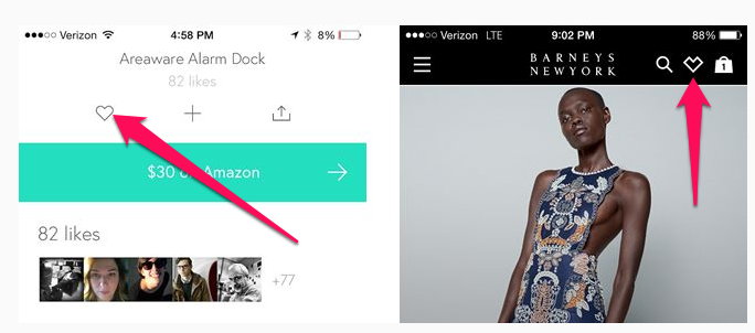
This allows the customer to move to their computer from a purchase initiated on mobile without having to reload their cart and tamper with product options multiple times.
A simple solution for this is adding share buttons that include the option to email product listings.
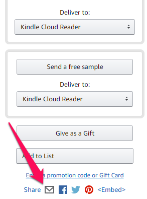
Amazon offers this option, despite having wish lists and user accounts, because the customer doesn’t need to be logged in to use these features.
Include a progress bar
I’ve already talked about using visual indicators to direct the attention and focus of your customer. Adding a progress bar to your checkout process ties back to this, but it also has a psychological element to it.

Our brains love completing little tasks. It provides a sense of accomplishment.
As that progress bar fills through the checkout, lighting up with each completed step, you’re increasing the customer’s desire to complete the task at hand (self-efficacy).
This fuels their motivation to finish checking out while also letting them know they don’t have far to go before they’re done.
Design for the thumb-friendly zone
When you were designing your ecommerce store, you may have taken mobile users into account, but what about the size of phones and how they’re typically held by consumers?
There’s a thumb-friendly zone for smartphone users and any kind of tapping outside that zone requires a position change or different fingers — and that adds friction to the shopping experience.
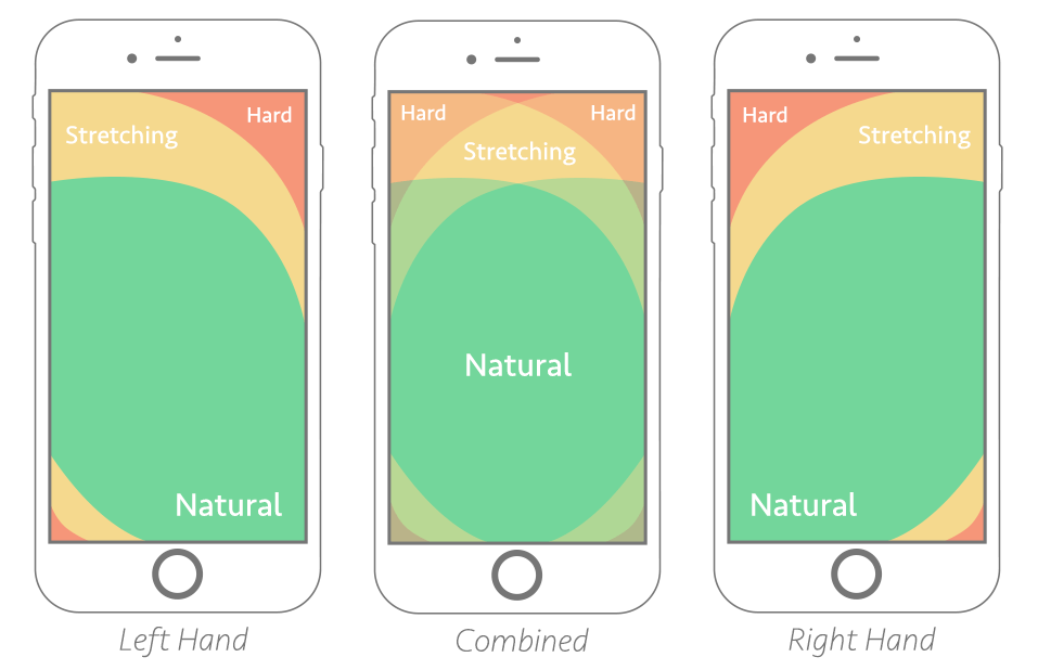
Design your mobile site so any navigation elements are placed for a human-friendly experience.
Like the way Airbnb has a sticky, floating navigation at the bottom of the screen instead of forcing the visitor to reach toward the top of the screen or change positions.

Support common mobile gestures
It didn’t take us long to get used to common finger gestures for zooming and navigating touch screen devices.
For many of us, it’s like second nature. I admit I’ve stumbled a bit when handling older tech that was touchscreen friendly but didn’t support gestures like swipe and zoom.

We’re so used to these common gestures that when they’re not present it can be frustrating.
During one study of mobile ecommerce site usability, it was documented that visitors regularly tried to double tap and pinch in order to activate zoom functionality.
Surprisingly, 40% of mobile ecommerce sites were found to lack the support for these commonly-used gestures.
And of the sites that do support zoom and navigation gestures (like swiping through pictures), only 50% of them inform visitors of the functionality.
Make sure your product images support the option to zoom with mobile gestures as well as the ability to swipe through product images.
Conclusion
While there are numerous elements to consider for mobile optimization, it shouldn’t be treated as a one-off mission that can be left once completed.
Mobile technology is changing constantly as are the techniques we use to sell products online. You’ll want to revisit your mobile optimization and monitor your mobile analytics to ensure you always provide the best shopping experience for your mobile customers.
What elements have you optimized in your online store to improve mobile conversions?
The post How to Create a Mobile Version of Your Online Store That Converts appeared first on Neil Patel.


Comments
Post a Comment