22 Creative Ways to Start Increasing Sales Online Today
If you’re hoping to increase sales, you’re on the right track.
Increasing sales is the key to any successful business. But the quick spike in revenue isn’t the only benefit you’ll get.
Increasing sales has an exponential value.
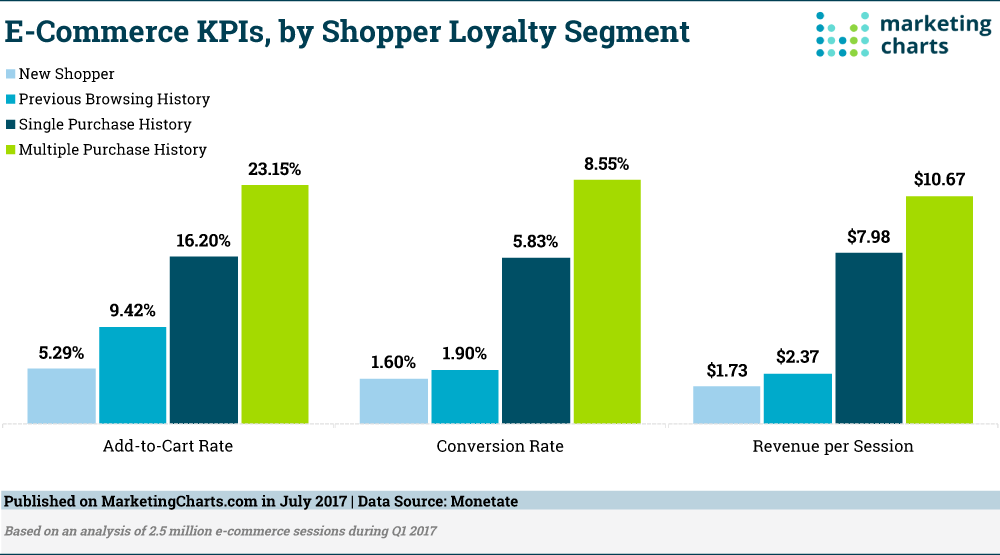
According to research conducted by Monetate, loyal shoppers are worth 5x more than their first-time counterparts.
By adding to that first sale with subsequent sales, you can completely change the way your customers interact with you.
It’s critical to make as many first sales as you can, then keep improving your funnel so you can effectively sell to as many new and old customers as possible.
In this article, I’ll show you 22 creative ways to start increasing your online sales.
Let’s get started!
1. Remove sliders from your homepage
If you’ve been following the most recent website design tips, you’ve probably at least considered including a slider image on your homepage.
It’s a popular move with a handful of benefits.
You can display a number of different products and features, and it looks like a welcoming way to introduce new visitors to the content you have to offer.
But if you want to increase sales, you should remove it immediately.
There isn’t any research to show that it increases sales, and there’s quite a bit of evidence to demonstrate that it actually confuses customers and drives them away.
When Siemens tested their rotating carousel, users didn’t recognize that there was a discount on the washers because the image changed too quickly.
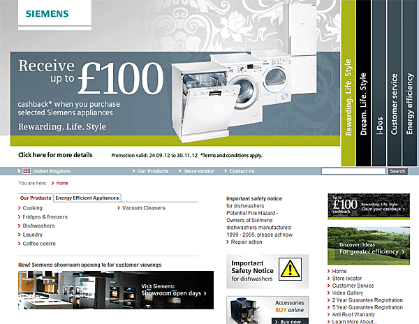
Thankfully, this was only a test, and we can learn from the lesson of Siemens.
Instead of including a large rotating carousel or changing slider on your homepage, focus that precious above-the-fold space on promoting your single most important message.

2. Point out which plan is most popular
People like doing things that others enjoy.
This simple psychological principle is known as the bandwagon effect. In essence, people view a body of similar people as experts on a topic.
This is why marketers constantly use phrases like “America’s #1 brand” or “recommended by most doctors.”
These statements add social proof to the product and influence the decisions we make. They also give us a sense of community with our choices.
We’re less likely to make a poor decision, we reason, if others have picked the same thing before us.
To use this effect to your advantage, you should point to the most popular plan or option on your pricing page. Don’t be afraid to promote it heavily.
AdEspresso clearly states which plan is most popular on their pricing page.
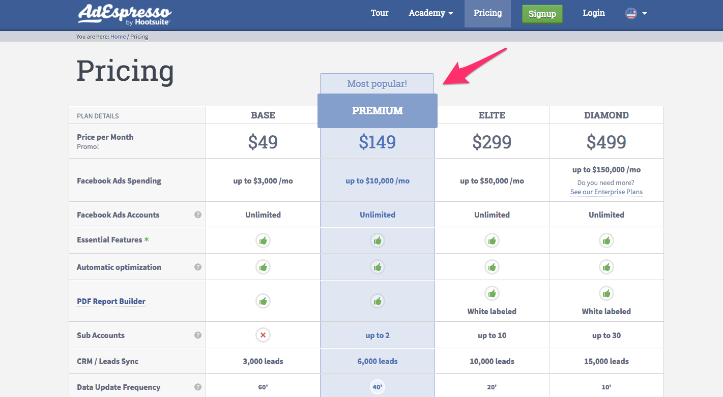
They’ve included a “most popular!” banner, increased the size, and changed the color of the entire option.
3. Include your contact information

While you might not expect it, the absence of detailed contact information is regularly listed as a common frustration by potential customers.
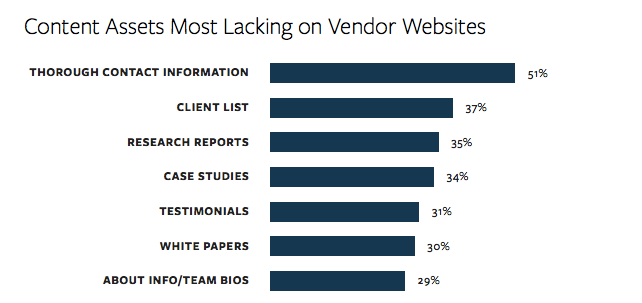
According to data by KoMarketing, the #1 content people find most lacking on vendor websites is contact information.
Even if you prefer to sell through an e-commerce portion of your website, many B2B customers would rather just talk to a sales representative personally.
Be sure to include as much contact information as you’re comfortable with including online. At a minimum, you should include a contact form that’s easy to access.
For even more sales, consider including a phone number, full mailing address, and email address.
Since this is a feature that so many visitors are looking for, it’s a good idea to include these pieces of information on every page of your website.
4. Use an inspiring plan name to encourage upgrades
By providing an inspiring name for your most expensive plans, you can increase the conversion rates for those plans.
MailChimp provides a great example of this effect in action. MailChimp offers three plans: a free plan, a low-cost plan, and a premium plan.
A few years ago, the plans were named “entrepreneur,” “growing business,” and “high volume sender.”
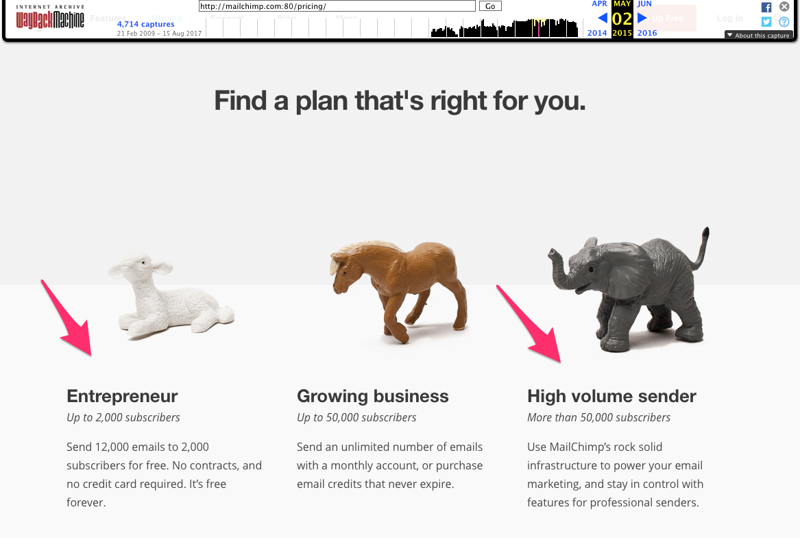
While this strategy did okay, the term “entrepreneur” is a compliment to most small business owners and indicates that the free plan is a good place to start.
Meanwhile, “high volume sender” connotes someone who is sending thousands of emails and cluttering the inboxes of their recipients.
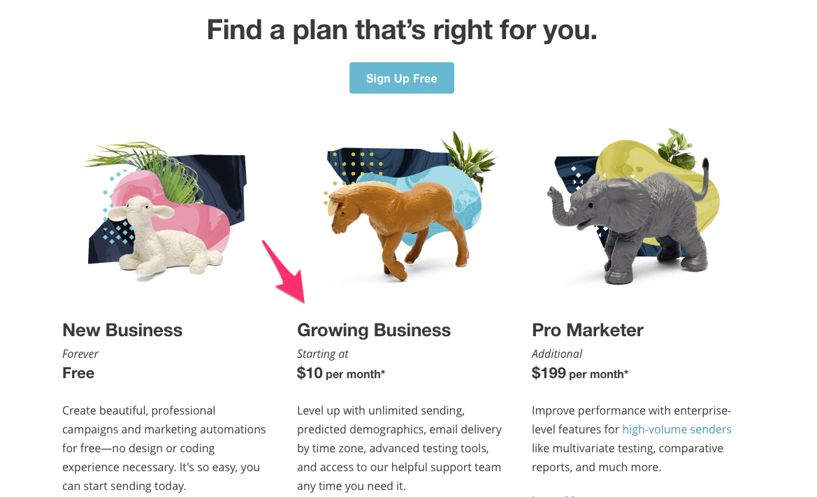
Today, MailChimp has changed the terms of their plans.
(They’ve also done some redesigns on the page. I’ll cover redesign in more detail later.)
Now, they use the term “new business” for the free plan. But even the newest business wants to see itself as growing, so the names encourage people to upgrade for growth.
And instead of being high volume senders, their premium members are now “pro marketers,” a label any customer would be happy to accept.
5. Remove references to buying above the fold
Sometimes, you need to convince your customers to get started with your product before you even talk about price.
If someone is completely sold on your product, the price will be less of a factor than if you start by explaining your plans and fees up front.
To do this, remove all references to buying above the fold on your website.
Many websites have a “pricing” option in the top navigation. If you do this now, try testing a version of your website without the pricing option in the navigation.
Evernote does a great job of promoting their product without mentioning sales on their front page.
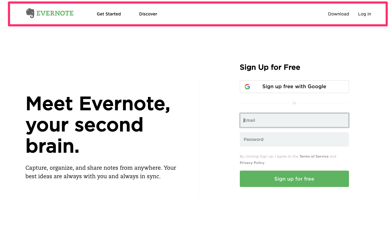
The header navigation bar doesn’t include “pricing,” “plans” or “buy,” and it’s not mentioned anywhere else on the page.
Instead, significant real estate is dedicated to encouraging new users to sign up for a free Evernote account.
By heavily promoting their free subscription, Evernote has become the industry standard in note-taking apps.
The company still makes a hefty profit from the users who pay for the full plan after experiencing Evernote’s features for free.
6. Make your landing page match your ad

Instead of split-testing a variety of ads and landing pages, work on making them correlate. This congruence will encourage users to sign up and buy the products you have to sell.
As Raphael Paulin-Daigle writes on WordStream, there are two parts to making a landing page match the ad.
First up is the scent match. Your landing page should closely resemble the layout and color scheme of the ad you’re using to promote that landing page.
Second, pay attention to the message match. You should market the landing page with the same copy (or at least the same focus) as your ad.
A great example of this is Air Canada. They promote low prices with the phrase “It’s the summer of great fares” on their ad.
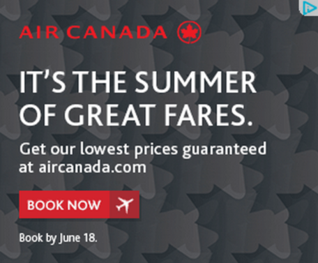
This copy and the gray background pattern are repeated on their landing page.
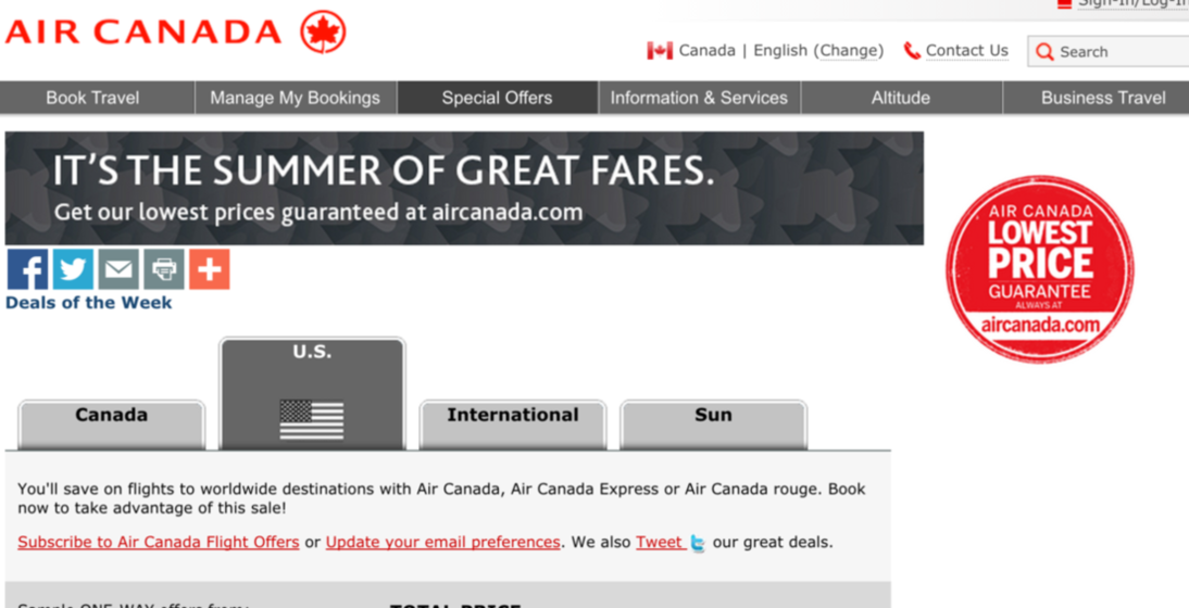
By keeping the scent match and message match closely aligned, you can increase the sales that come through your paid ads.
People feel most comfortable when they sense alignment in your messaging and your visual branding.
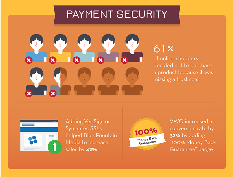
7. Show trust icons on the checkout page
Building trust is one of the psychological keys you must use to skyrocket your sales.
In one study, a shocking 61% of online shoppers decided not to purchase because a site lacked a trust seal, according to Acquisio.
It’s that important!
There are a few different ways to instill trust and provide security on your checkout page. First, include a basic signifier of trust, like a brief description of your security measures.
Zappos uses multiple trust signals, like these two their checkout page.
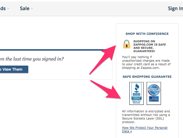
They reassure potential customers that their information is safe and even provide a link to a detailed description of the security measures they use on their site.
But to take it even a step further, you can include a certified trust seal. This requires that you get verified by a third-party vendor. You will then have permission to display their badge.
While it will boost your sales, it can cost money to have a secured site seal from these companies.
If you’re unsure about which to choose, research has shown that Norton has better trust levels than any other seal.
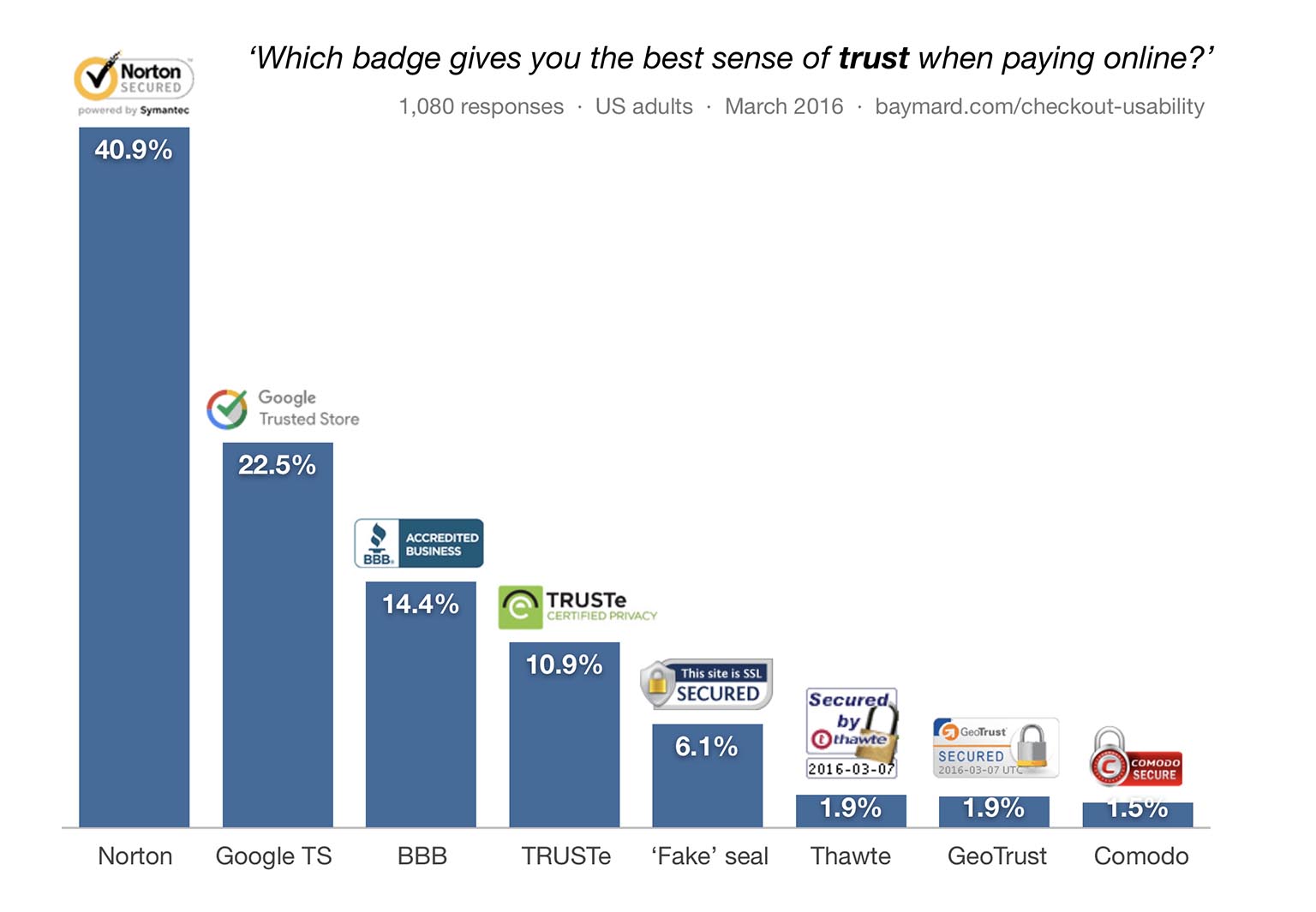
By proving you are to be trusted with a customer’s sensitive credit card information, you’ll skyrocket the number of sales you complete.
8. Include images with your testimonials
Just like we prefer to buy the most popular plan or option, we also want to make sure that other people have found success with the product, as well.
I’ve already talked about how impactful testimonials can be to increase the sales on your website.
But to take it to the next level, you can include further verification of your social proof.
In other words, include pictures and other identifying information about the people who have endorsed your product or service.
Images of the people writing the quotes are most effective.
This proves that you haven’t made up the testimonials, and it also provides a way for users to relate to the people who have written those testimonials.
By providing some form of contact information, potential customers can even reach out and verify that the testimonials are valid.
Bizzabo includes photos and Twitter usernames for the people that endorse their product.
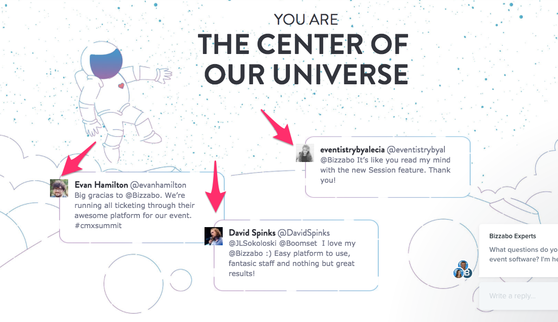
This is a powerful form of social proof. You’re indicating that not only are your testimonials real, but you are happy to let curious visitors contact the people who’ve endorsed your product.
9. Create a sense of urgency
If your sales page is an airplane, urgency is the jet fuel that propels it into the stratosphere.
By providing a final end date for a promotion, launch, or sale or your product, you can drive sales from people who would normally wait to buy at a later time.
Of course, people who wait tend to not buy at all. Instead of hoping they’ll come around eventually, you should provide a compelling reason for them to invest now.
Urgency is how you do it.
Marcus Taylor experimented with increasing the urgency on his offer: a complete promotion package for musicians, including recording time and iTunes distribution.
The first version of his sales page didn’t include any urgency.
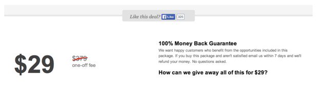
He created a second version that included three urgency triggers. First, he had a Time Left to Download button that counted down to the deadline.
Second, he included the number of bundles that had already been purchased. Since there was a limited number, this increased the urgency.
And finally, he included a status on the offer. With all the pieces in place, his second version looked like this.
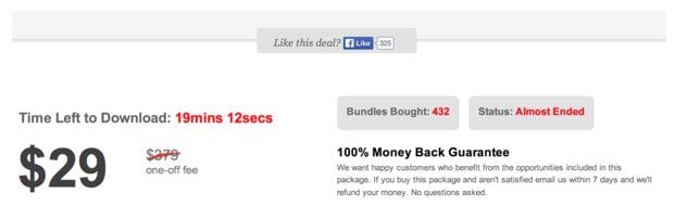
This second version was a massive success, hitting a conversion rate of almost 10%.
Adding even a small indicator of urgency can make a dramatic impact on the success of your sales.
10. Offer a money-back guarantee
For customers who are on the fence, you should provide a way to make sure that they end their transaction as satisfied customers.
One of the most effective ways to do this is to offer a money-back guarantee.
Essentially, this is a promise that you will refund the purchase in its entirety if a set of conditions are not fulfilled.
Common conditions include customer satisfaction with the product, price match, or even the results the customer has with the product.
While you shouldn’t promise a guarantee you can’t deliver, the more ironclad the promise, the better it will increase your sales.
Hotels.com uses a stunningly comprehensive price guarantee.
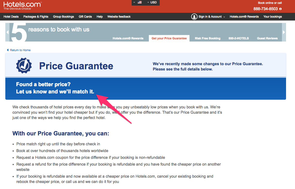
By promising that a customer will always get the best price, Hotels.com gives customers a sense of confidence in their purchase and encourages more sales.
One of the great things about a guarantee is that few customers will take advantage of it, even if they aren’t satisfied with the product because it’s a hassle.
11. Remove steps in the checkout process
Simplifying the checkout process is a great way to ethically boost your e-commerce sales.
Amazon has reaped untold dollars from their One-Click Ordering option, and there’s a simple reason why: We are lazy.
When I say “we,” I mean you, me, and your customers.
Each extra step in your checkout process makes it more complicated to complete, and adding to that process will drive away a fraction of your potential buyers.
Research by the Baymard Institute showed that 27% of cart abandonments are due to a complicated or extended checkout process.
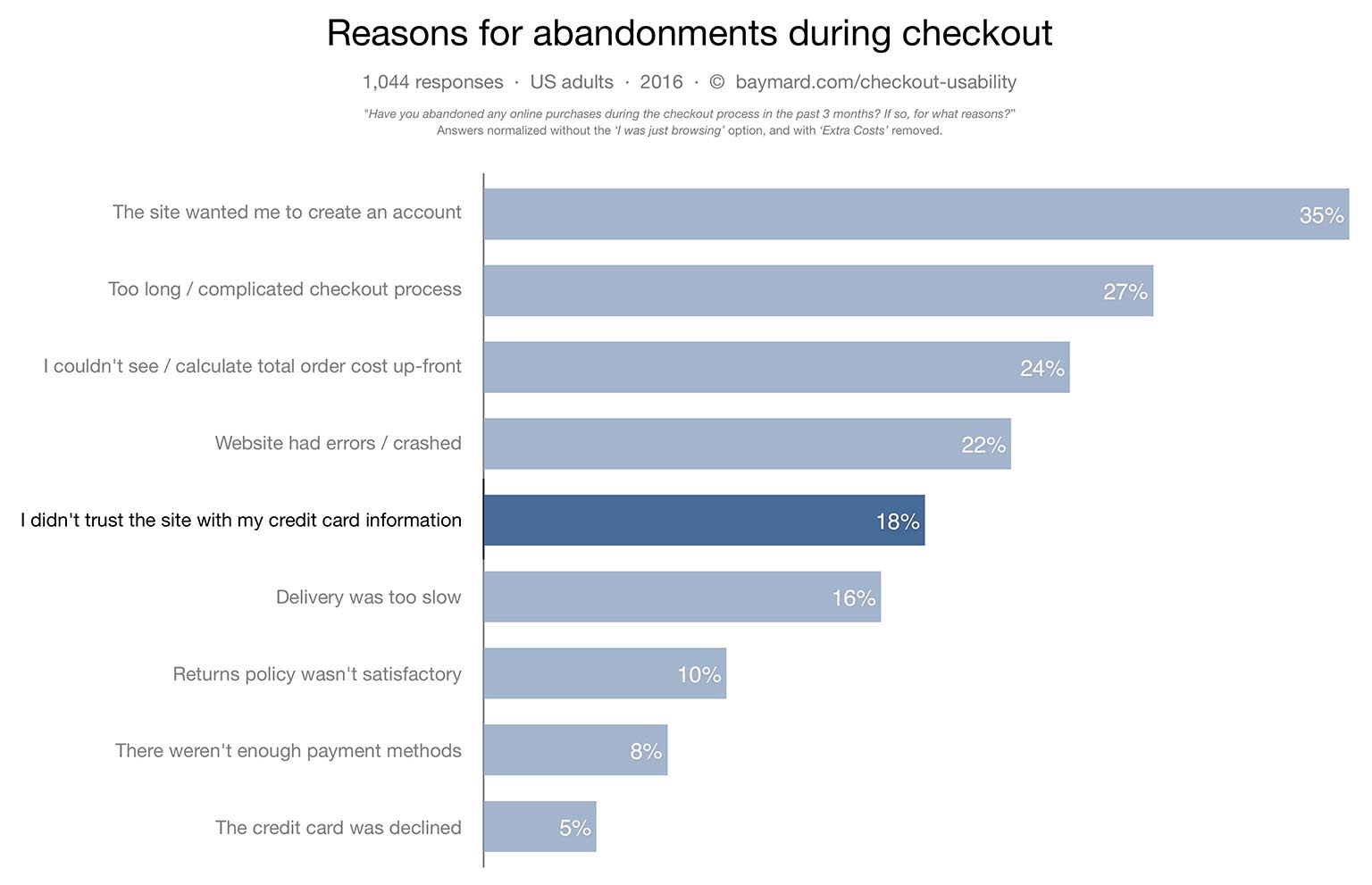
There are a few ways you can earn these 27% of customers back.
First, you can include all your checkout details on one page. Each new page increases the likelihood that someone will abandon the checkout process.
Second, you can hide options until potential customers enter the previous information. For example, you can present a form that only requests an email address and a name.
Once a customer fills these out, the credit card details appear. And finally, shipping information appears after credit card details.
This reduces friction in the checkout process and will increase your sales.
12. Remove the navigation bar during checkout
Every opportunity you give a customer to navigate away from the checkout process is a chance that you’ll lose a sale.
Instead of customers clicking from checkout to their cart (which they may ultimately abandon), you want to move buyers in a seamless flow from browsing to purchase.
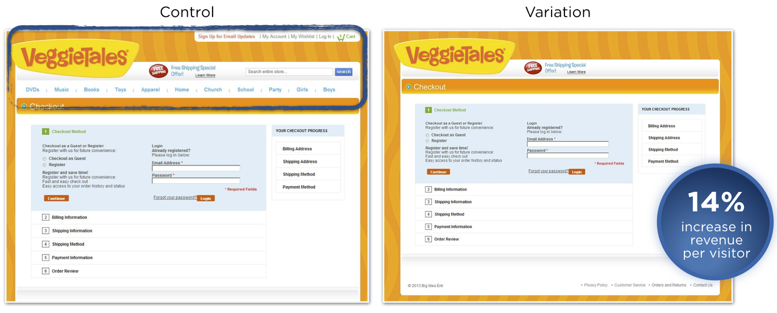
One of the simplest ways to do this is by removing the navigation bar from the checkout process.
VeggieTales, a children’s cartoon program, garnered a 14% increase in revenue per visitor just by removing the navigation bar during checkout.
By forcing users to either continue the checkout process or leave the website, you’ll naturally build a flow toward a successful order.
If you have other links on the checkout pages to other destinations on your site, remove those, as well. The checkout funnel should be as smooth as possible to navigate.
13. Use your customer’s voice in your copy
The best way to sell is to appeal directly to your customer. And the best way to appeal to your customer is to use his or her voice in your language.
Of course, it can be difficult to quote your potential customer directly.
But if you conduct enough interviews with existing customers, you can find the main reasons they purchased your product or service.
Using these common struggles and reasoning, you can craft a sales page that converts better than anything you’ve ever written.
FreshBooks knows that small business owners wish accounting was easier and faster. Their primary copy uses phrases business owners would use themselves.
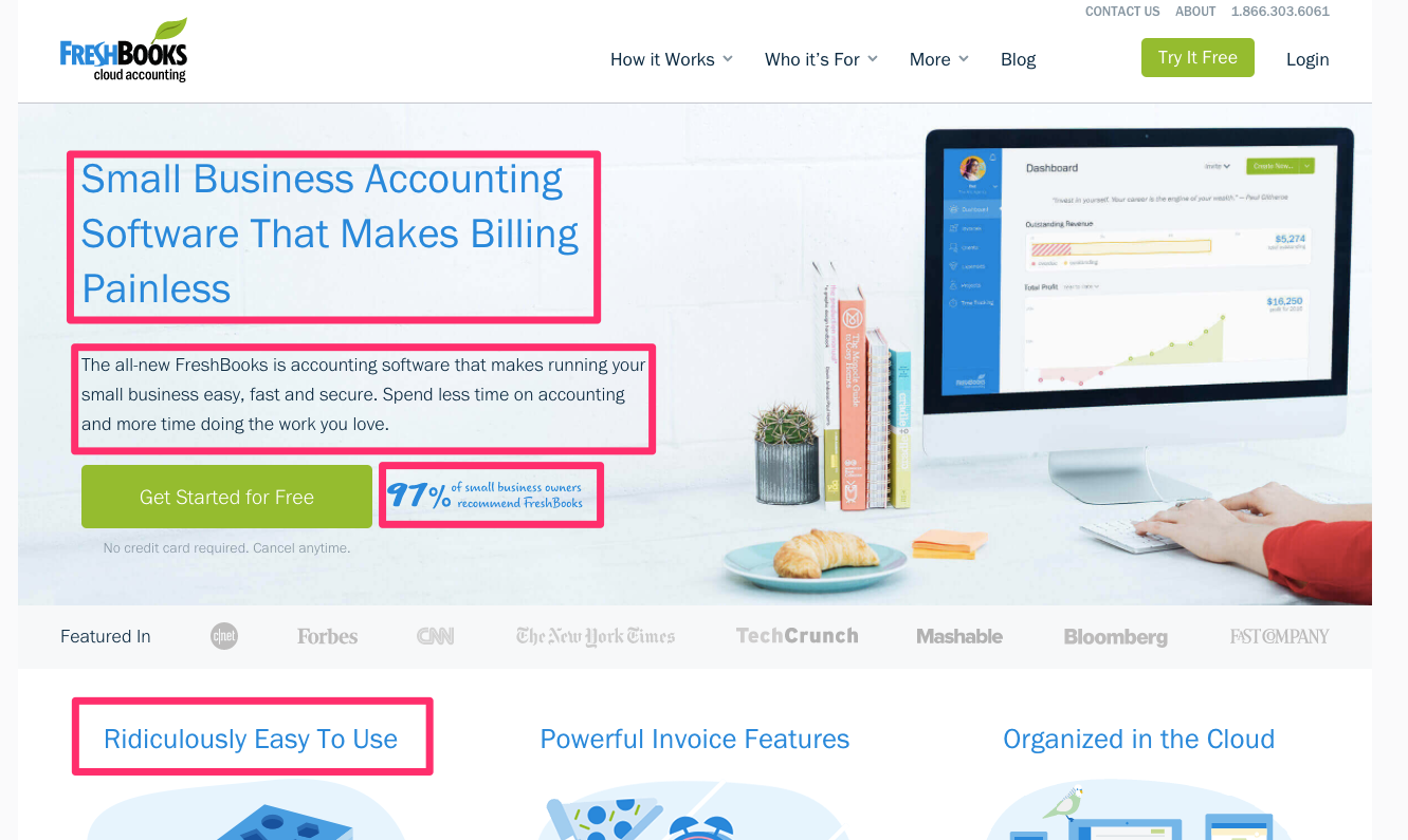
This copy is compelling because it uses the language business owners have probably said to themselves on occasion.
To include this kind of sales-generating copy on your website, review customer testimonials or even schedule interviews with satisfied customers.
Understand exactly what they’re looking for and what their current frustrations are. If possible, get exact quotes on what frustrates them.
Use these quotes (or paraphrase them) to create copy that converts more sales than you ever thought possible.
14. Sell a longer timeframe
One of the quickest and easiest ways to sell more is to sell for a longer time period.
If you’re in the service or SaaS industry, you probably sell based on monthly subscriptions.
For your most committed would-be buyers, however, you can encourage them to invest in a yearly plan instead of a month-to-month plan.
Typically, these yearly plans are discounted. But because they ensure a greater total revenue stream, they’re a great deal for companies.
On your sales page, include a mention of your annual plan. Be sure to provide compelling reasons to pay yearly.
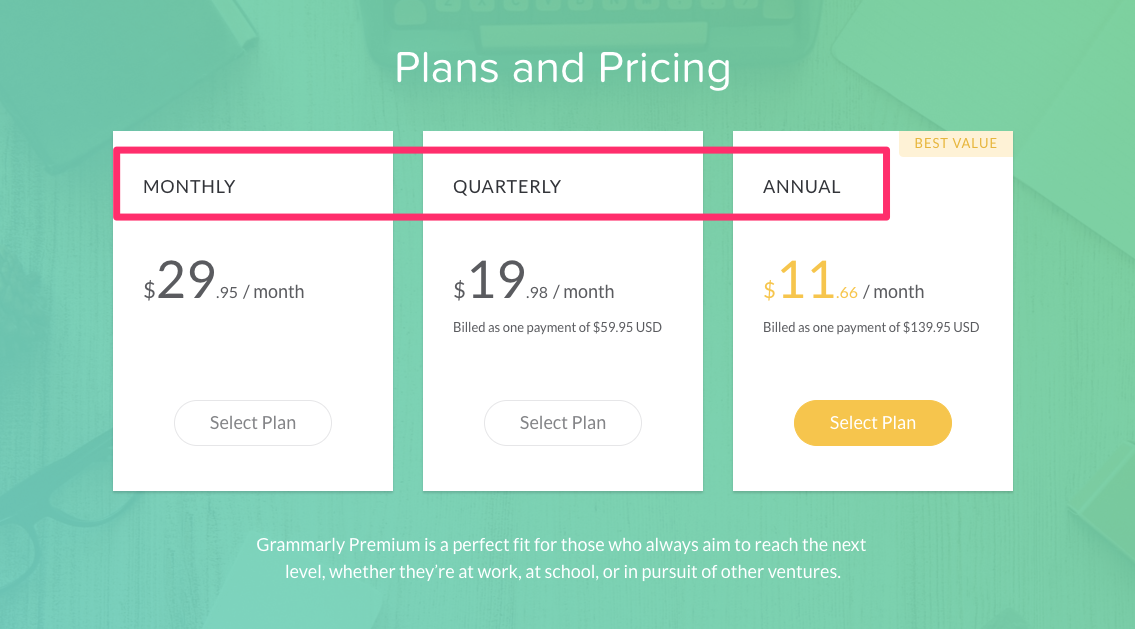
Grammarly sells in three different ways: monthly, quarterly, and yearly. By selling their yearly subscription at just over ⅓ the price of their monthly subscription, they encourage sales.
While this is more difficult to implement for products, consider creating a subscription-based offer to renew the product on a frequent basis.
If you’re selling a disposable item like soap or a line or products like clothing, you can easily create a subscription model to take advantage of this lucrative sales strategy.
15. Split-test your headline display
While you’ve probably heard that you should split-test your headlines, you may not have heard that you should also split-test the way you display your headlines.
The surrounding image and text display can make significant changes to the conversion rates on your sales pages.
Mindvalley started with this headline.

They had hypothesized that the smiling faces next to the headline distracted from the words, so they removed the image and focused just on the text.
This version got a 7% boost in opt-ins. But instead of removing images altogether, they decided to add a subtle back image and break up the headline into two lines.
This version outperformed all other tests they conducted on the headline, receiving a massive 230.41% boost.
By tweaking and testing the headlines you’re using to promote your products, you can encourage more visitors to engage with what you’re selling and buy more.
16. Use live chat
While you should ideally answer every customer objection in your copy, this is sometimes impossible.
Every customer has a different question, and it’s unfeasible to answer all of them all the time.
What’s the solution? Installing a live chat app into your sales page. This allows customers to quickly interact with you and get an answer to their burning questions.
Since most customers won’t directly ask their questions through email or other means, this is a great way to increase conversions by responding to objections.
A number of companies have had huge success with chat apps. Intuit increased their conversion rate by 211% by adding a chat feature.
Currently, mHelpDesk uses a chat app to drive more sales and answer questions.
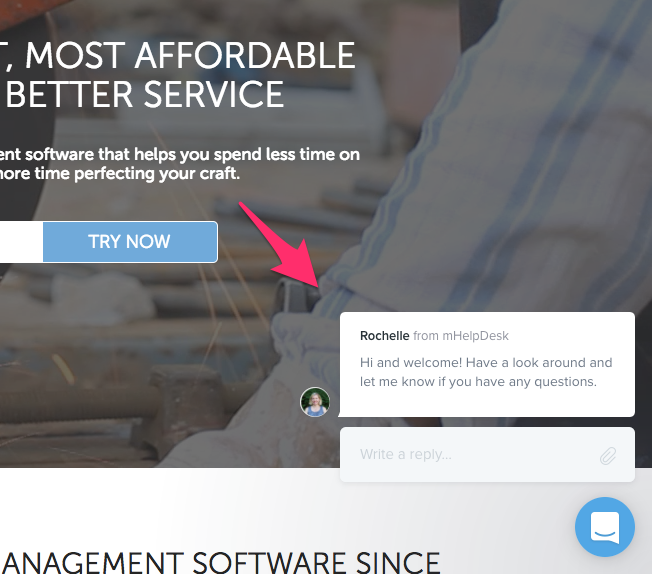
A typical feature of chat apps is a default question posed to the visitor.
mHelpDesk does a great job of making this non-confrontational and eliminating all appearance of a sales pitch.
By simply asking the visitor to “look around” and chat if he or she has any questions, they’ve discovered a simple way to encourage discussion without pushing a product.
17. Include social proof
I’ve mentioned social proof a few different times in this article. And while mentioning your most popular articles and including testimonials are great, nothing beats live social proof.
This is a newer feature that allows you to include a popup box that lets visitors know about recent purchases of your product.
Typically, these are small notifications that slide in on the lower left-hand corner. They usually indicate a user’s name, picture, and the product he or she bought.
Leadpages includes social proof on their pricing page. The options continually show recent purchases, ranging from a few hours to a few days ago.
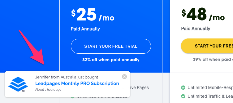
For someone who is undecided about your product, this can be a powerful motivator. It shows the recency of purchases and shows that your product is popular right now.
A great tool that you can use for this feature is the simply-named app Proof.
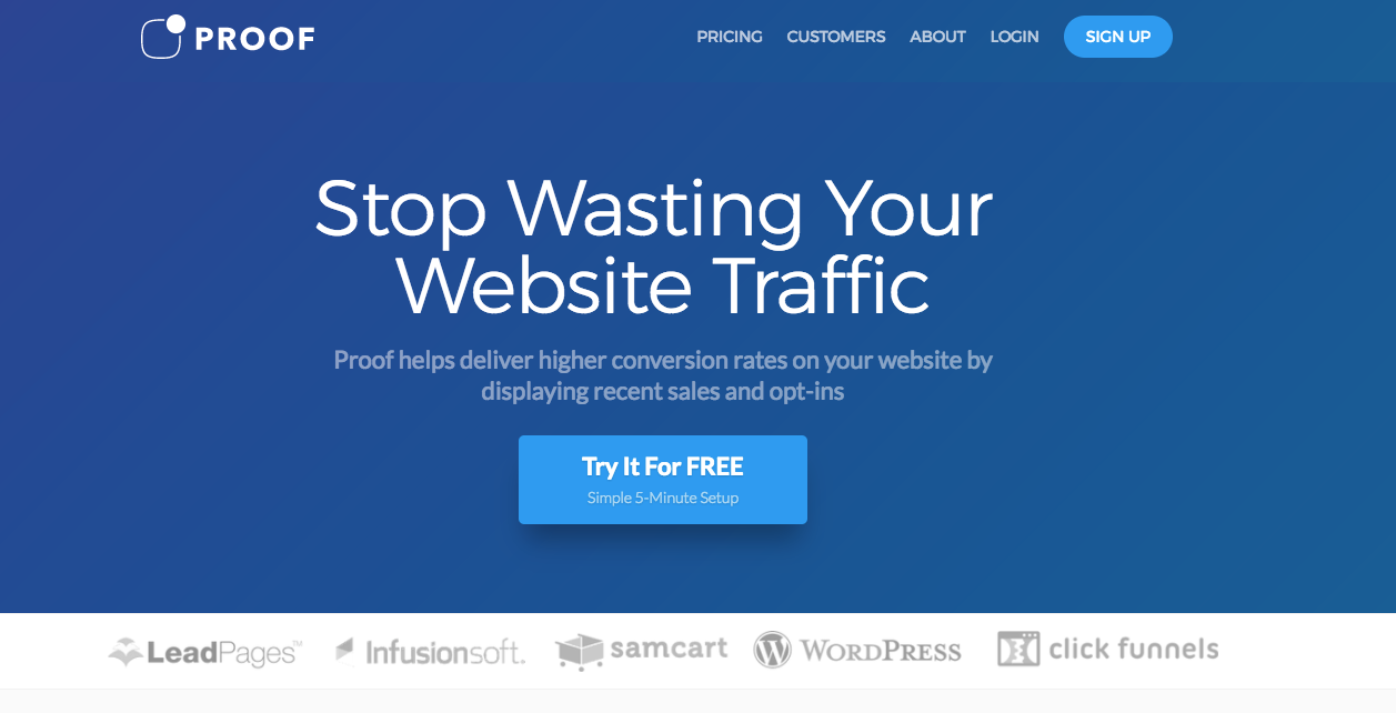
Proof integrates with most sales pages and landing-page builders to create a user-friendly experience that encourages more sales.
18. Use a personal call to action
If you’re using a generic call-to-action button, it might be time to try something new.
Instead of general language, choose an action with a personal flair. Consider using a first- or second-person pronoun like “my” or “you.”
This phrases your button less like a cold command and more like a recommendation from a friend or even your prospect’s inner dialogue.
Shopify uses “start your free trial” instead of just “start free trial.”
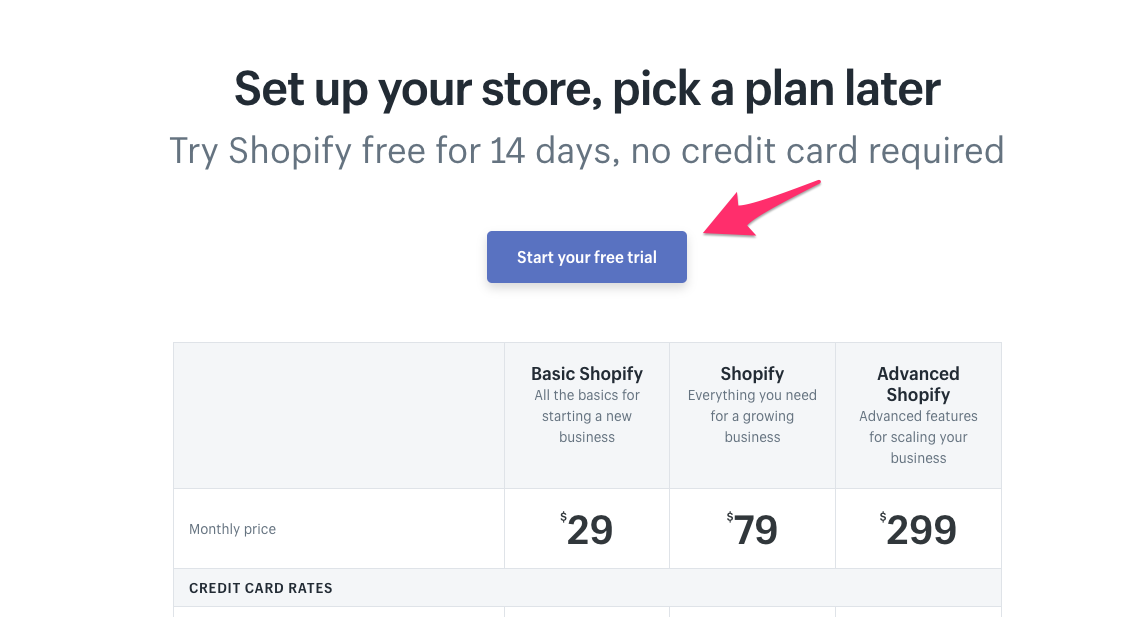
As always, I recommend testing a few different options.
Experiment with copy that speaks to your customer (as in the Shopify example above) and copy that uses the customer’s own voice, such as “start my free trial.”
You can also try more colloquial language such as “oh heck yes,” as Jon Morrow writes on the opt-in page for his guide to getting published in Forbes.
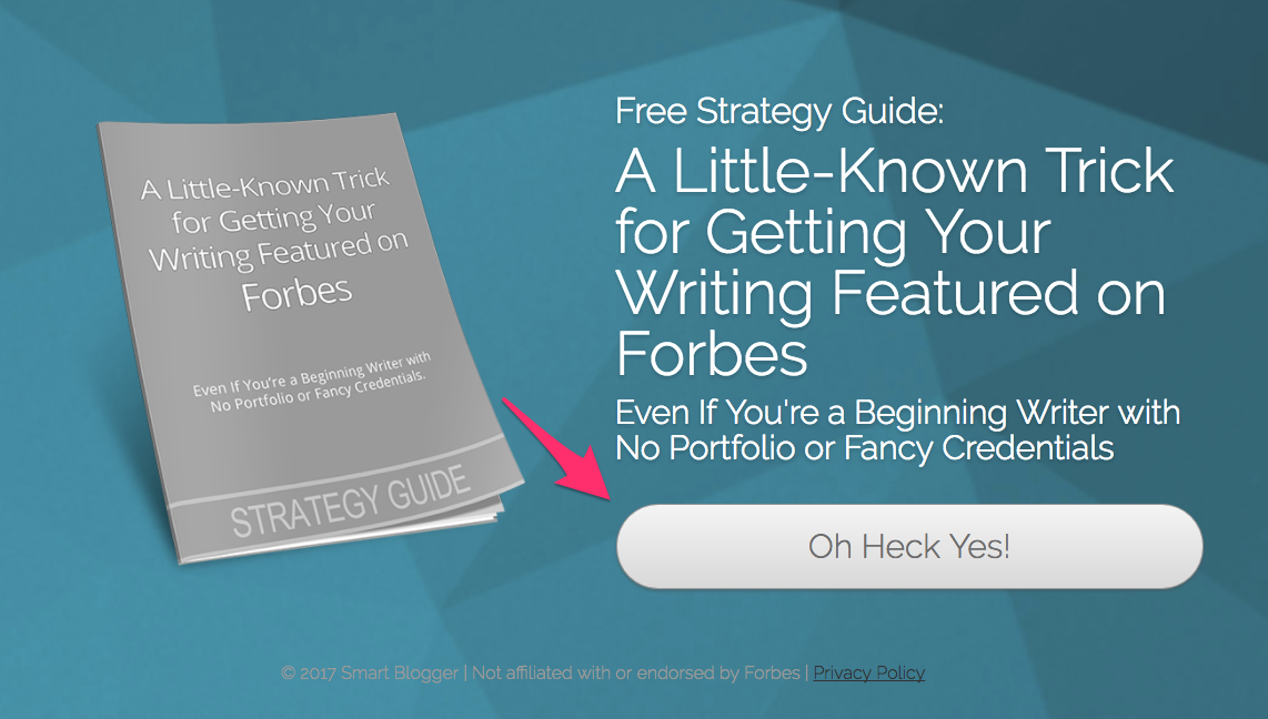
Because it’s unexpected, this casual button copy can catch your visitor’s eye, encourage purchases, and drive more sales.
19. Recommend a plan or option
If you have a series of plans or options, users can quickly get overwhelmed and not know what to choose.
It may seem like a good idea to confuse your visitors. If they’re unsure about the features, they’ll buy the more expensive option just in case, right?
But that actually turns out to be false. When users are confused, they usually just leave your site.
If you really want to drive sales and conversions, you need to make the buying process as easy as possible.
The best way to do this is to choose one plan and openly recommend it. Provide a reason why you think it’s the best for the user, and watch it become the most-purchased option.
Freshdesk includes one recommended plan. They even include an animated windmill to draw attention to it!
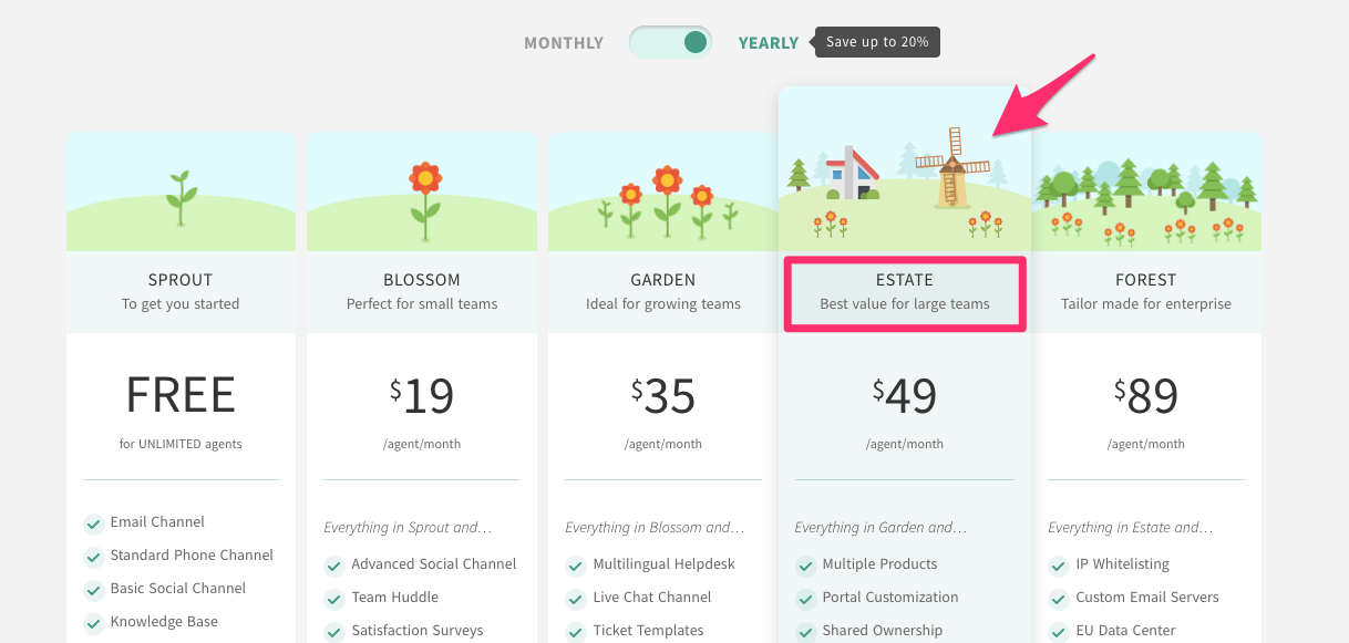
Notice that Freshdesk doesn’t just say “buy this one.” Instead, they provide a reason with the phrase “Best value for large teams.”
Since their user base includes organizations with large teams, this will immediately grab the attention of their visitors.
And while “value” is a subjective term, the recommendation of the company (who clearly knows the product) provides an additional layer of authority for the plan.
20. Retarget your ads to reach more customers
If you aren’t retargeting your ads, you’re missing out on a huge opportunity.
If a visitor comes to your site, you should develop a targeted ad campaign to reach them as soon as they leave. Otherwise, you’re just leaving money on the table.
For best results with retargeted ads, you should create custom ads to appeal to custom audiences.
For example, let’s say that you own a bicycle e-commerce store.
You should show one set of retargeted ads to potential customers who add racing bikes to their carts, and different ads to those who are interested in mountain bikes.
This type of customized retargeted ad can be well worth the investment and drive a crazy amount of sales.
You can boost sales overnight with the right Google AdWords campaign. Luxury watch company Watchfinder achieved 1,300% ROI by retargeting ads.

You’ll notice that the different types of watches appeal to different kinds of customers based on which kind of watch they’re most interested in.
Experiment with a few different types of retargeted ads and adjust based on the ad’s ROI.
21. Improve your design
If your website looks outdated, you’re going to lose out on valuable customers.
To maximize the number of sales you make on your website, consider hiring a professional designer to give your sales page a facelift.
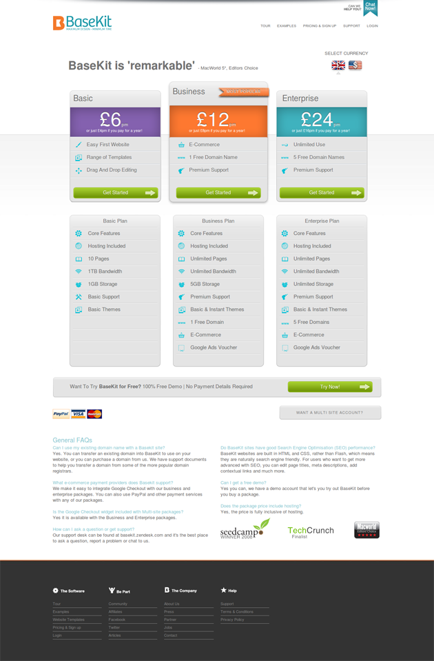
Basekit increased conversions by 25% by using brighter, bolder colors on their sales page. On their original page, the dark gray plan categories faded into the light gray background.
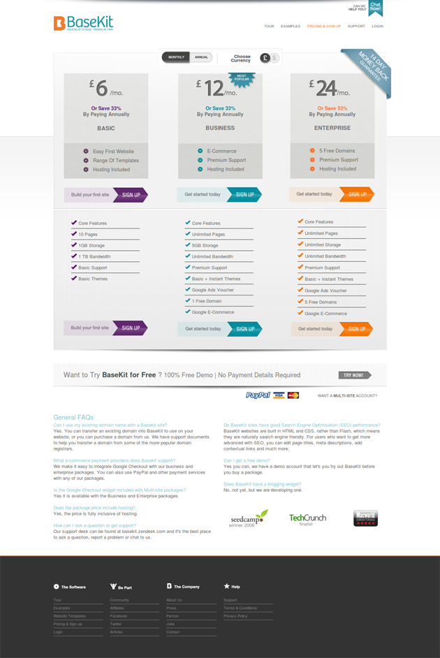
When they revised it, they included brighter colors for each plan and added a colorful Get Started button.
I’ve mentioned before that you should constantly make gradual changes to your website design to improve conversions.
No place is more important for this than your sales page. I recommend using Optimizely to gradually improve the layout and bring up your sales.
If you’re just getting started, I’d recommend including bold colors on your plans, making the call-to-action buttons more distinct, and highlighting a popular or recommended plan.
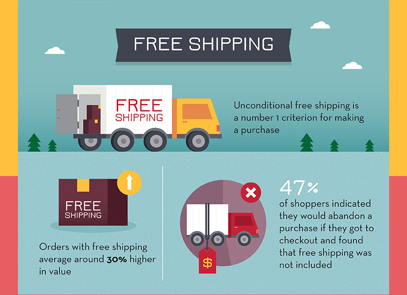
22. Offer free shipping
While this is probably the most expensive option in this list, it’s the option with the most promise.
Research by Acquisio indicates that 47% of shoppers would abandon a cart if they got to checkout and found that free shipping wasn’t included.
That’s almost half of your potential buyers!
If you’re serious about increasing your sales, you need to figure out a way to prevent customers from leaving due to your shipping policy.
There are a few ways to try this.
- Offer free shipping. If you run the numbers, you may find out that you can cover the cost of shipping if the total order is over a certain amount. One advantage of this number, like Amazon’s $35 limit, is that people with $25 orders will usually choose another $10 in merchandise instead of abandoning their carts.
- Discreetly include shipping in the price. While you may be worried about increasing your prices, the lure of free shipping may make up for this. Consider tacking on an extra dollar or so on each item, and use the revenue to cover shipping costs.
- Offer flat-rate shipping. If you can’t offer free shipping, consider a flat-rate option. This is an easy way for customers to understand that they’ll have to pay for shipping, but it doesn’t allow an unexpected price to derail the purchase mid-checkout.
Conclusion
If you’re working to increase online sales, you need to start trying techniques that your competitors haven’t even thought of yet.
To do this, you’ll need to test both time-honored and creative ways. Whatever you try, you should base it on the best research and make sure to test it yourself.
If it increases your conversions, keep it! If it doesn’t, move on to another way to boost the revenue on your site.
Which tactic will you use to increase your online sales?
The post 22 Creative Ways to Start Increasing Sales Online Today appeared first on Neil Patel.


Comments
Post a Comment