17 Reasons Why Your Website Should Have a Clean and Simple Design
Your website is the digital storefront of your business.
If its design is lacking, people might decide that they don’t want to do business with you.
According to research published by Blue Corona, 48% of people determine the credibility of a business by its website design.
And the research is clear: Simpler designs are better.
What research, you might ask?
I’ll explain in this article. These are the 17 reasons why your site needs a cleaner, simpler design.
1. Simple design is timeless
One of the biggest problems with websites is that they become outdated quickly.
It seems like, as soon as you’re about to finish with one update, it’s time for another. But it doesn’t need to be that way.
Busy designs lose their allure and become dated quickly.
But history has shown that simple designs, like Britain’s Keep Calm and Carry On poster from 1939, withstand the test of time.

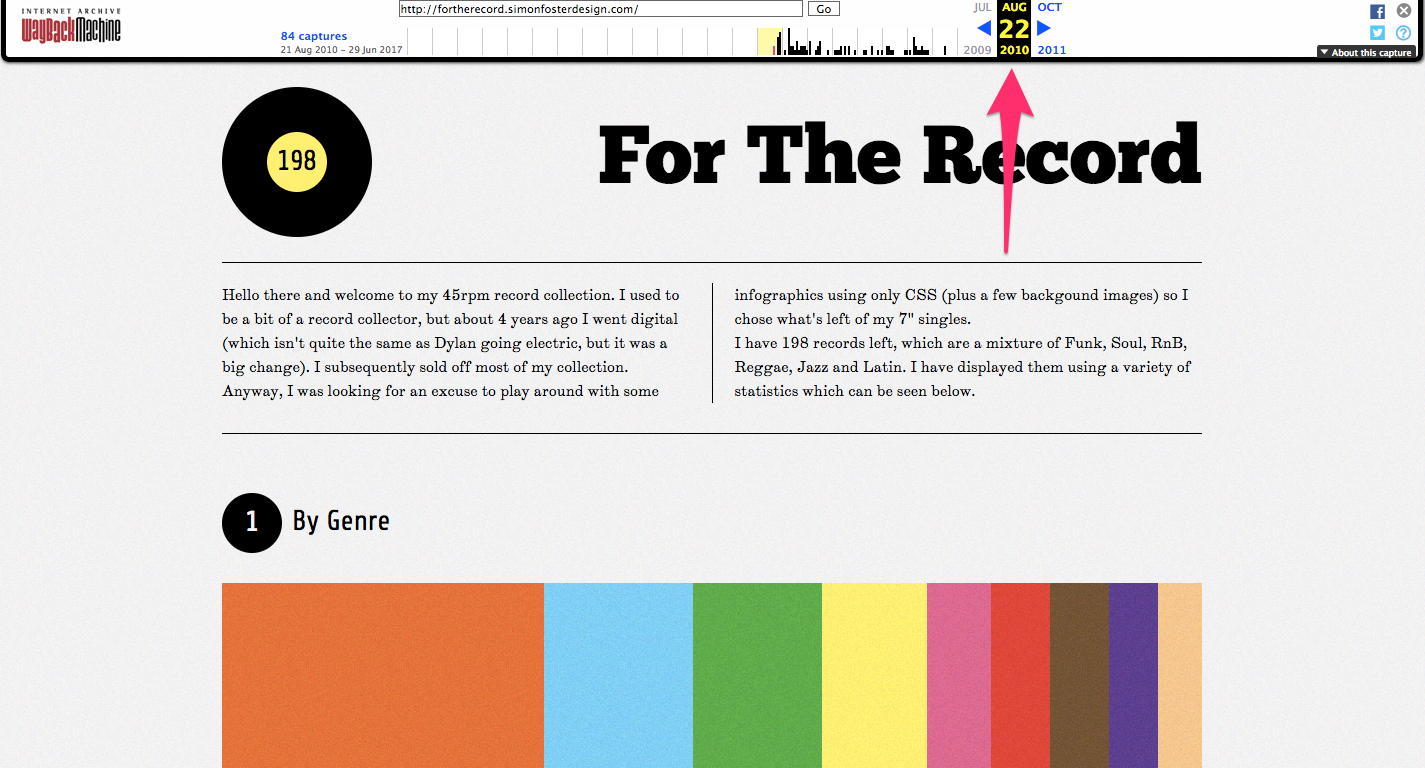
When you’re hoping to explore the statistics of his antique record collection, designer Simon Foster looked to simple and clean design for a timeless look.
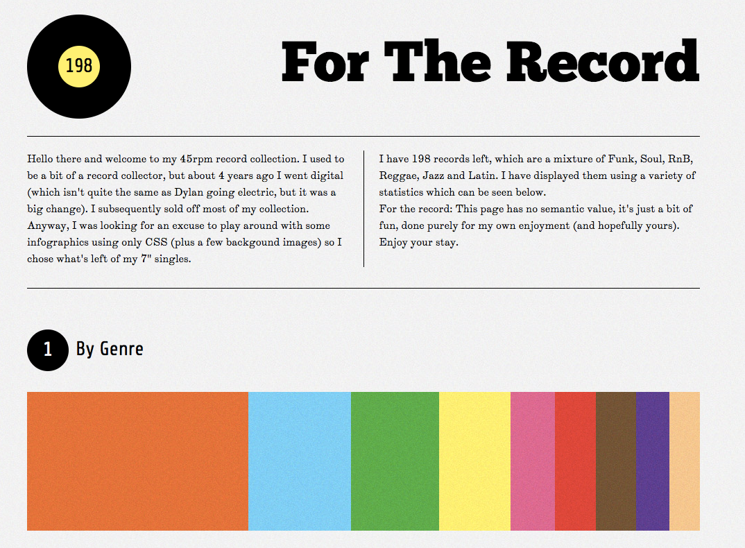
By focusing on basic typography and the simplest of layout, Foster’s website maintains a fresh and new feeling, even though the site’s layout is from 2010.
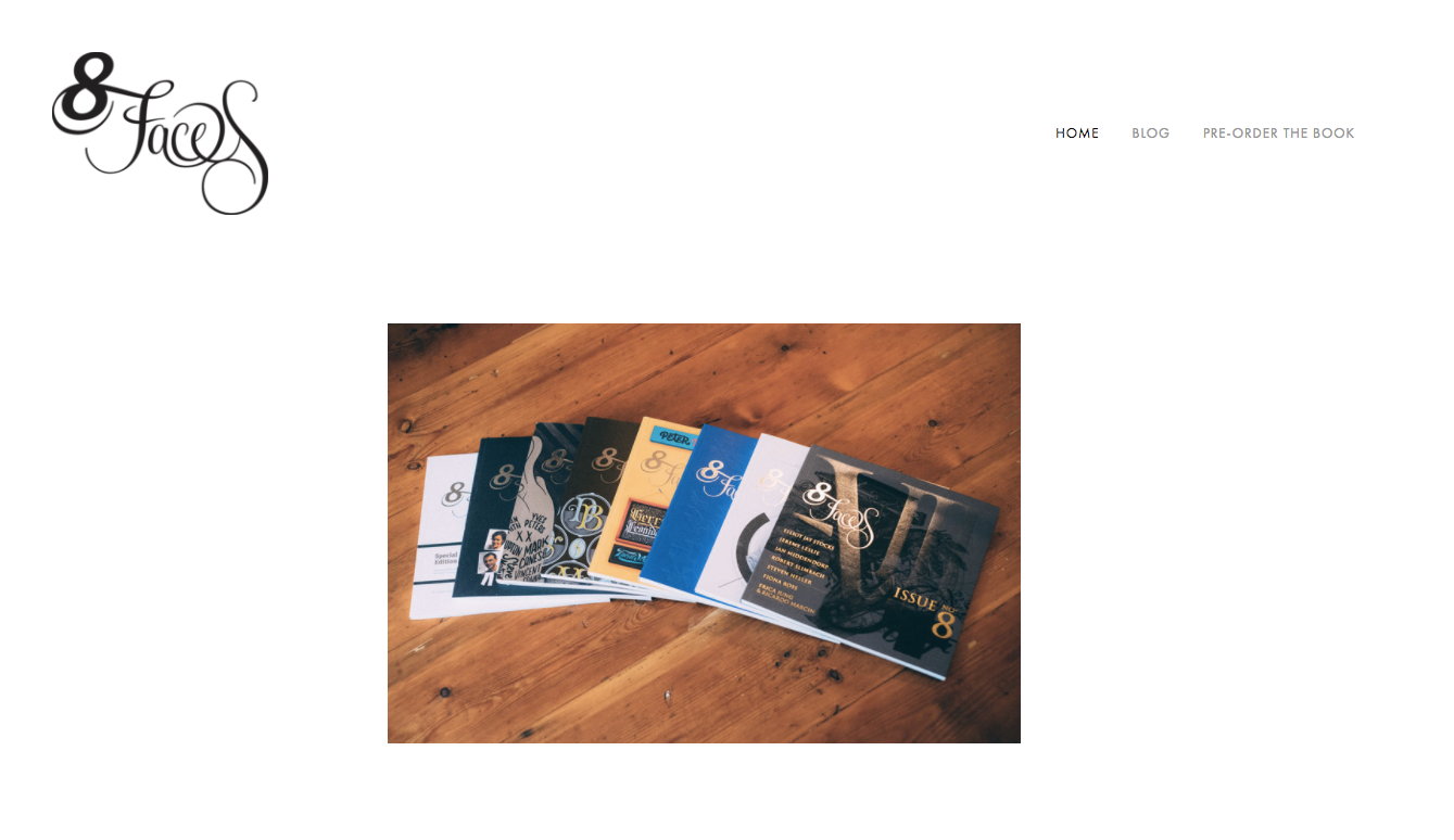
Designer Elliot Jay Stocks wanted his typography layouts to last, and he decided to include them in a published book.
To promote his 8 Faces book, he chose a simplistic design to accent the ageless quality of the project.
By using a simple design on your website, you can withstand the changing tides of website fads.
By choosing a simple color scheme and basic yet bold typography, you can please website visitors for a long time.
You’ll need fewer revisions and can save money with less-frequent updating. Even more importantly, you will maintain an appealing look for years to come.

2. Simple design is easier to scan
It’s no secret that Internet users don’t read every word on your website.
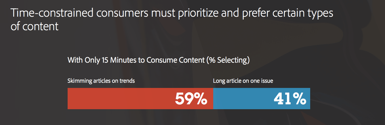
According to Adobe, 58% of users will skim articles if they’re constrained by time.
To maximize the number of people who see the most important parts of your content, it’s vital to strip down your design to the bare essentials.
By removing unnecessary elements, you can draw the reader’s attention to what matters most.
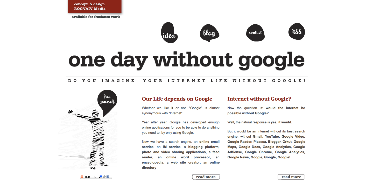
One Day Without Google uses white space to make it easy for readers to understand exactly what the site is all about within minutes of visiting.
The most common argument against this type of design is centered around the problem of content.
What should you do if you have a lot of pages and data you want to promote? For an answer, I turn to well-designed news sites.
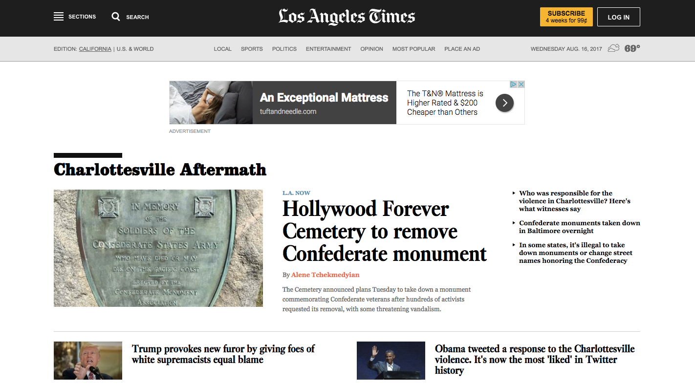
While most news sites are cluttered and distracting, the Los Angeles Times leaves its site clean. It draws focus to a small selection of headings and uses white space for the rest.
By choosing your most important content, you can make your text easy to scan and increase the number of people who read what you have to offer.
3. Simple design is more accessible

Every website needs to include features that make it accessible to as many people as possible.
Thankfully, simple design is easier to make accessible.
Without the fragile bells and whistles that often prevent users from enjoying your site, clean design provides a positive experience for everyone.
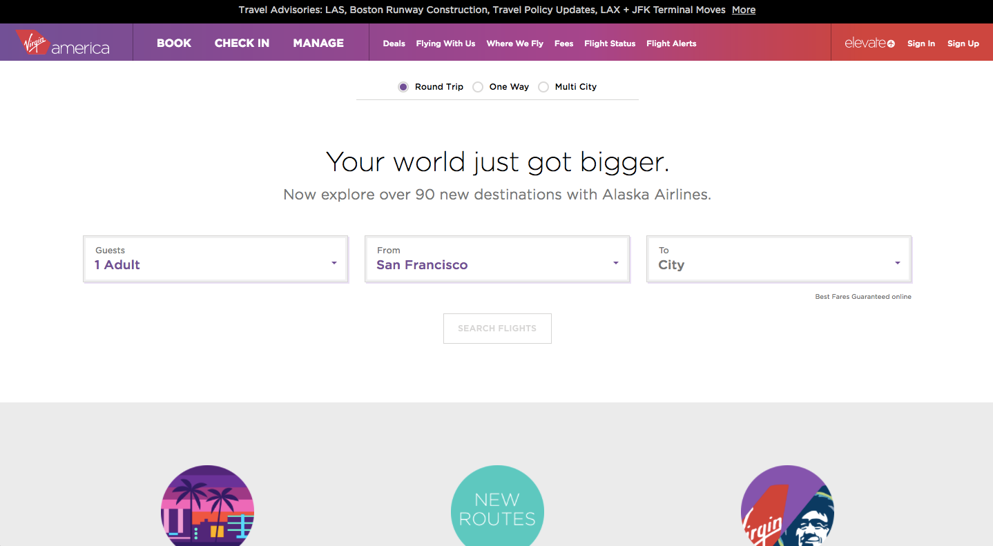
Virgin America’s site has been praised as being highly accessible, and it’s no wonder. The site is clean and simple, with a basic call to action and navigation bar.
To increase the number of people who can view your site, include minimalistic and accessible design.
4. Simple design strips away the salesy feel
One of the biggest problems of flashy websites is that they appear too “salesy.” In an attempt to increase revenue and conversions, complex sites often drive away potential customers.
Minimalistic design, on the other hand, invites visitors to learn without feeling like the site is selling to them.
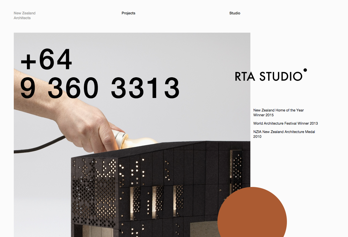
While RTA Studio features a prominent phone number on their site to increase sales for their architecture work, the clean design prevents the page from looking like a grab for customers.
This focus on aesthetics can make any site more visually appealing.
And since the call to action can be blended in with the layout of the site, users are less likely to find the sales pitch affronting.
5. Simple design loads faster
Site load time is a critical factor for SEO and user experience.
According to data published by Tyton Media, website bounce rates increase by 100% when a page takes four seconds to load.
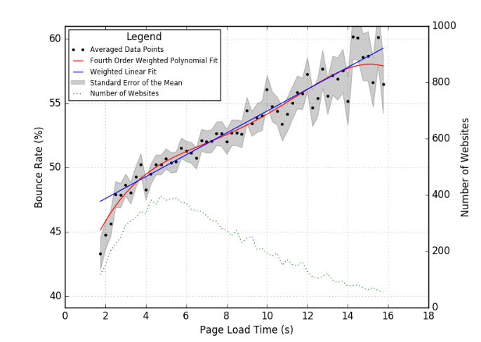
Typically, the features that slow down a site are complex images, features, and options.
By eliminating these, a minimalistic website will load at blazingly fast speeds and attract new readers and more search engine traffic.
Leo Babauta’s Zen Habits homepage has minimal text and no images. It loads the most recent post and doesn’t even include a menu bar in the header.
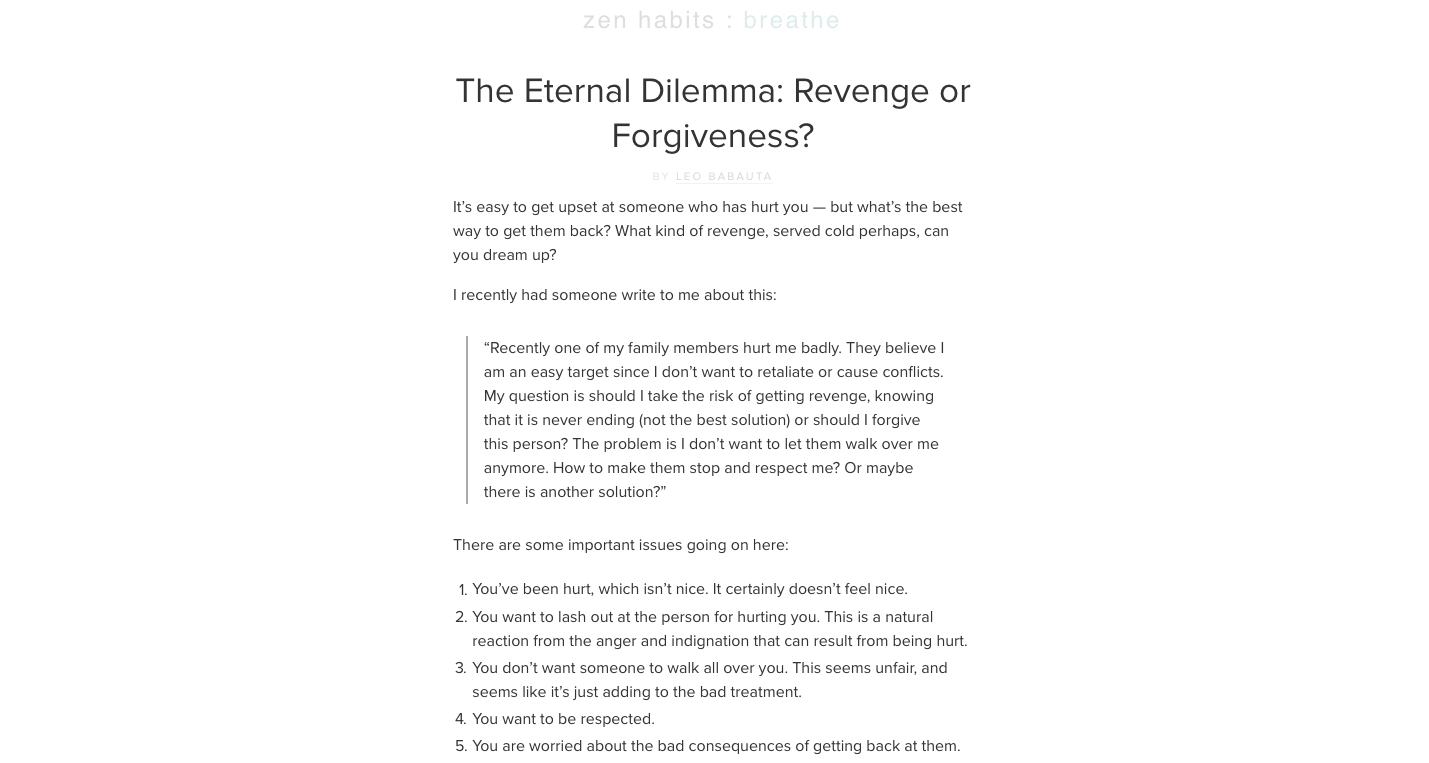
It’s no surprise that the site loads incredibly fast, according to GTmetrix.

The site’s tiny amount of text gives it lightning fast speeds. It’s no wonder Zen Habits is one of the most successful blogs around.
6. Simple design is easier to use

An easy way to improve the usability of your website is to simplify it. By limiting the number of options on the site, you can improve the user experience.
The first place to start is the navigation menu. Remove any extraneous options or buttons that only a few people click on.
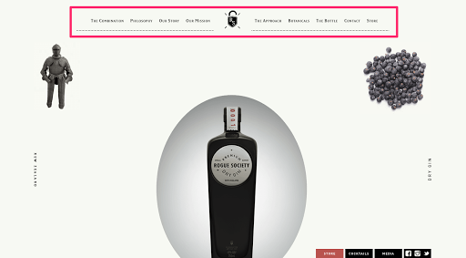
By providing a simplistic header bar with navigation options, Rogue Society Gin makes it easy to use the site for learning about the brand or buying the product.
Once you’ve simplified the navigation, improve the home page.
People tend to follow the directions you give them, so you are best served to include minimal content on the front page of the site and encourage only one course of action.
This can allow you to direct users to click on your bestselling products or start a free trial instead of mindlessly browsing other content.
With a carefully-crafted and intentional direction in your design, you can make your site easier to use for visitors and make the most of your site.
7. Simple design improves conversion rates

As much as I know that this isn’t a reliable factor in the value of the site and its quality, I can’t help but notice that the website doesn’t seem to be a priority for the business owner.
Since I’m well-versed in the value of a quality website, it tells me that the business owner isn’t serious about conversions or sales.
The work you put into your design can have a huge effect on the money you make on your site.
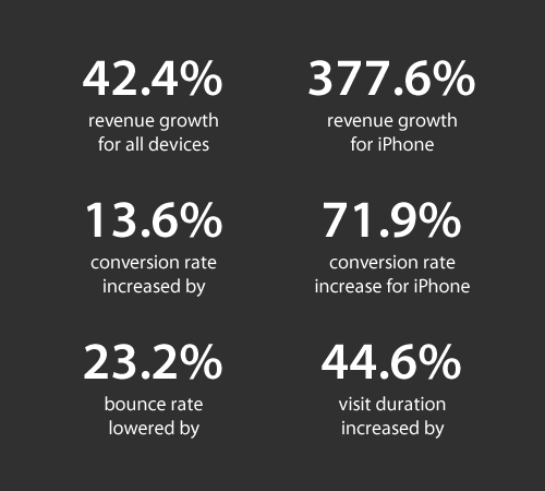
A clean and simple design is one way to show that you’re serious about your brand. The old design of the SkinnyTies.com website was cluttered and difficult to read.

There was a lot going on, and the site didn’t look professional. In 2012, they updated to the more open and minimalistic look it retains today.
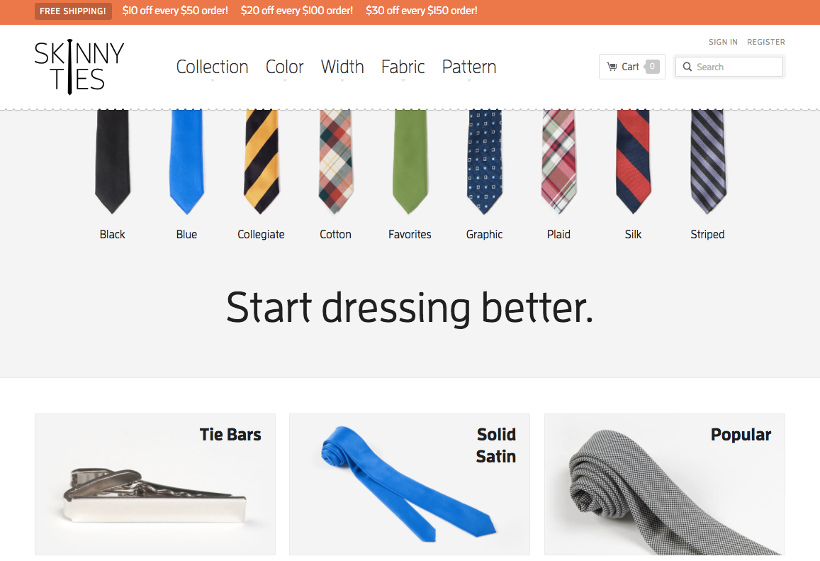
They put the focus on the products they sold, added white space, and eliminated the complicated menu bar and updates that cluttered the old website.
The redesign led to a 13.6% increase in conversion rates and a 42.4% increase in revenue.
This is an especially valuable change for e-commerce sites. The e-commerce site Makr has a layout that directs users to buy with its simple display of product categories.
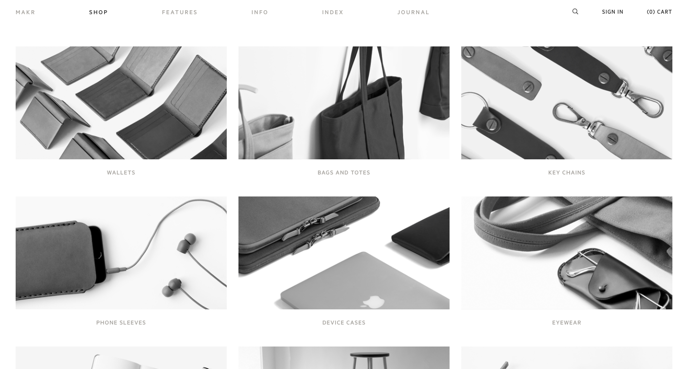
This simplistic design puts the focus on the products and drives sales.
8. Simple design is easier to build and fix
There’s nothing “easy” about designing a website.
But when you have a massive, cluttered site, it can be difficult to keep things organized. And if you need to update the site, it quickly becomes a hassle.
Nobody would know better than a designer the importance of clean code. Interface designer Yaron Schoen uses this to great effect on his personal website.
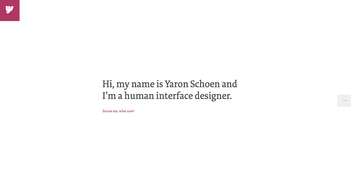
But perhaps even more beautiful than the clean and simple design he’s employed is that his code is impeccable.
It’s simple, and if he wanted to fix a bug, it wouldn’t take a lot of time.
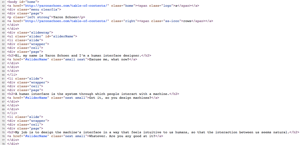
This kind of design lends itself to easily readable, human-friendly code that’s simple to update and easy to maintain.
9. Simple design builds trust
If you want to sell anything through your website, you need to make sure that you can earn the trust of your visitors.
But this can be difficult if you have a messy and busy website design.
Research conducted on online e-commerce sites found that presentation was directly related to the trust viewers had in the site.
According to Dr. Brent Coker from the University of Melbourne’s Faculty of Business and Economics, humans are “psychologically hardwired” to trust beauty.
This, he says, applies to websites as well.
To build trust with your website design, include copious amounts of white space. Keep the layout simple, and focus each page on one thing at a time.
ETQ uses white space and minimalistic design to build trust among customers for its e-commerce store.
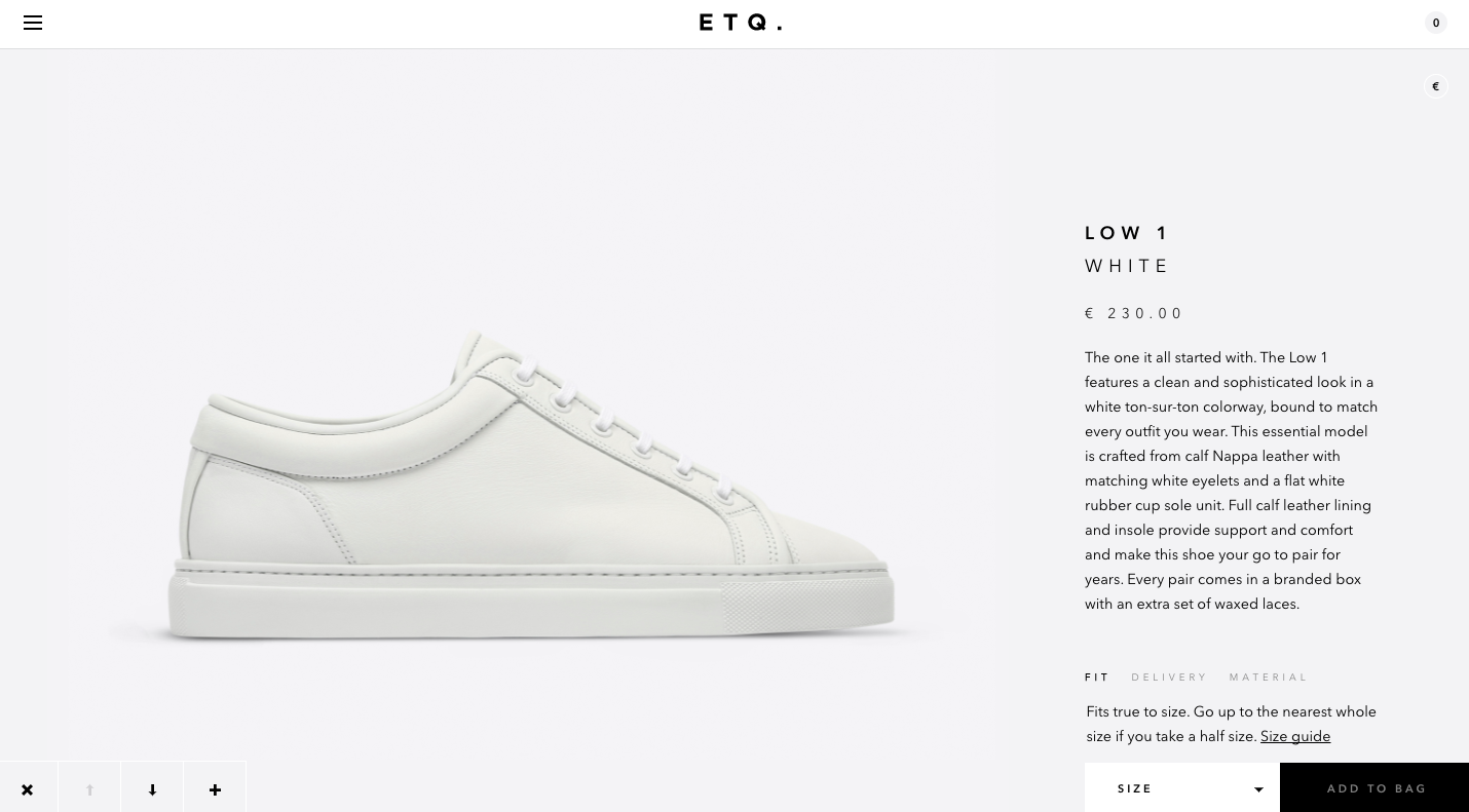
The design shows that ETQ is serious about their products.
And while it isn’t an ironclad source of reliability, a company that invests in quality website design likely values quality website security.
A clean website can promote trust with your audience and help you sell more.
10. Simple design is cheaper to host
It’s not a secret: the less extraneous content you have on your website, the less space it requires on the server.
While a large website with lots of images and videos takes up massive space to host, a clean and simple design will reduce the workload on your server.
(Plus, those space-hogging resources will make your conversion rate plummet as well.)
That means less expense for you, since most hosting companies charge extra for more storage.
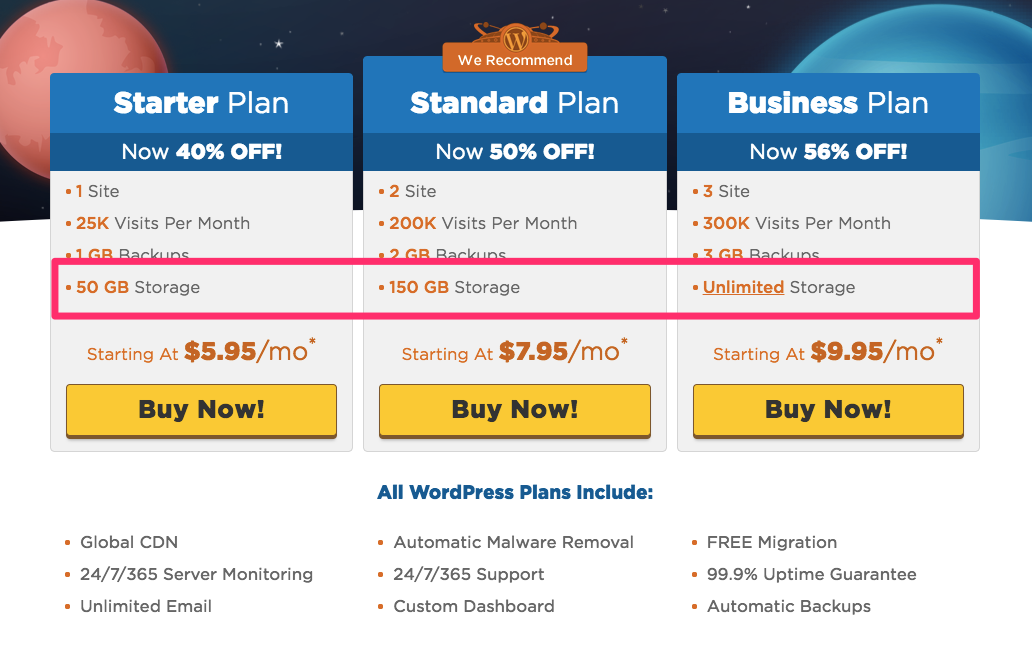
On GoDaddy, for example, the free plan only allows the user 100 GB. This is more than enough for a basic site, but a complex site might max out the space.
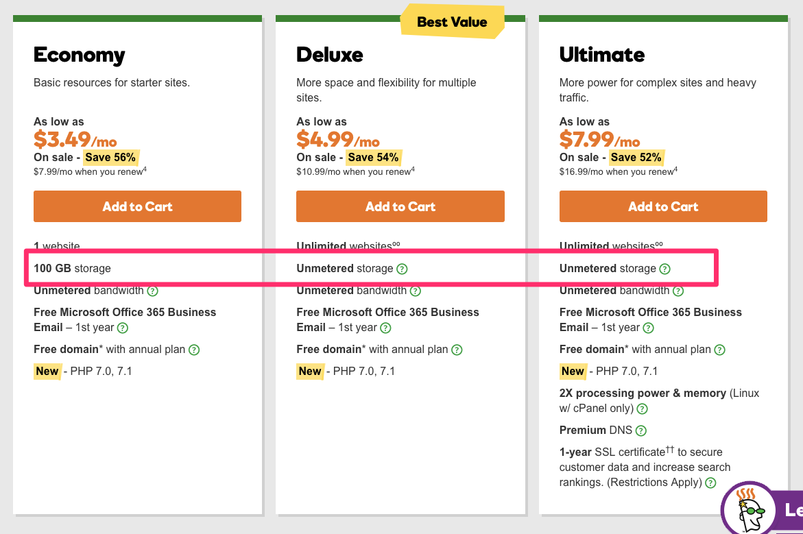
Another major hosting company, HostGator, has a similar tied pricing scheme.
By simplifying what you display on your site, you could potentially save thousands of dollars on hosting over the course of a few years.
11. Simple design looks more professional
People are more likely to do business with a website that looks professional, and you can achieve this effect with a simple design.
The truth is that you are better off with a minimalistic design than one that is complex because it’s easier to recognize the immediate value you can provide as a company.
To achieve a professional look, include a simple color scheme and large lettering explaining the benefits of working with your company.
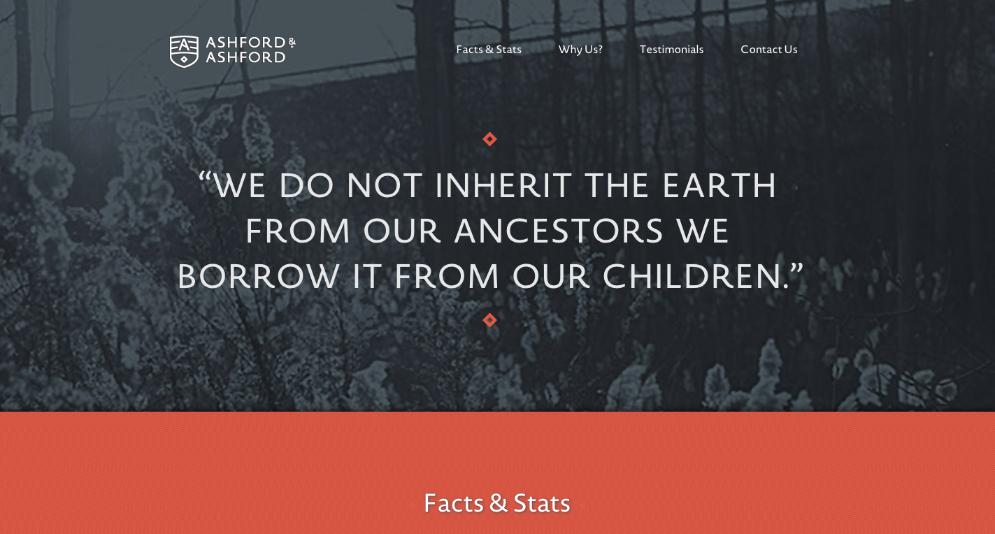
Ashford & Ashford, a firm that finds unclaimed property for its users, creates an appearance of timeless professionalism with their classic logo, black-and-white imagery, and red accents.
12. Simple design makes a great first impression
You’ve heard that people judge you within a few minutes. But did you know that people judge your website just as quickly?
A study conducted by Google found that visual complexity impacts the appeal of a site within 17 milliseconds of a visit.
In other words, people prefer a website with a simple design, and they judge it within 60 seconds of seeing it.
So, what can you do to make your website more appealing? Instead of spending your time focusing on a few different features, products, or benefits, pare down the choices.
Provide one main message, and drive the point home with engaging graphics and a bold and simple design.
A Spacecraft For All makes a compelling first impression with its clean focus on the satellite the website is about.
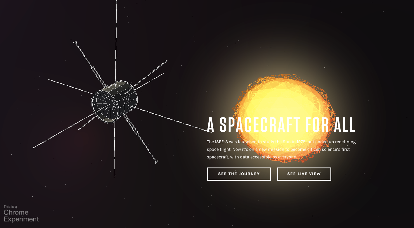
By providing a basic image, headline, explanatory text, and only two buttons, the first impression is inviting and engaging within a few seconds on the site.
13. Simple design is easier for Google to understand
One of the factors influencing your place in Google’s results is how your site is structured.
A simple structure with a defined hierarchy will be easy for Google to crawl, and you’ll see higher rankings as a result.
A complicated structure without any defined order or pattern, on the other hand, will be difficult for Google to analyze and you’ll end up with poor search engine traffic.
One of the best ways to improve your site architecture is to list your menu on your site.
A complicated site structure is difficult to include, but a simple flow of ideas will make a great addition to a minimalistic website.
Adidas uses a simple menu on its homepage.
When you hover on the menu, however, it expands to show an organized site structure.
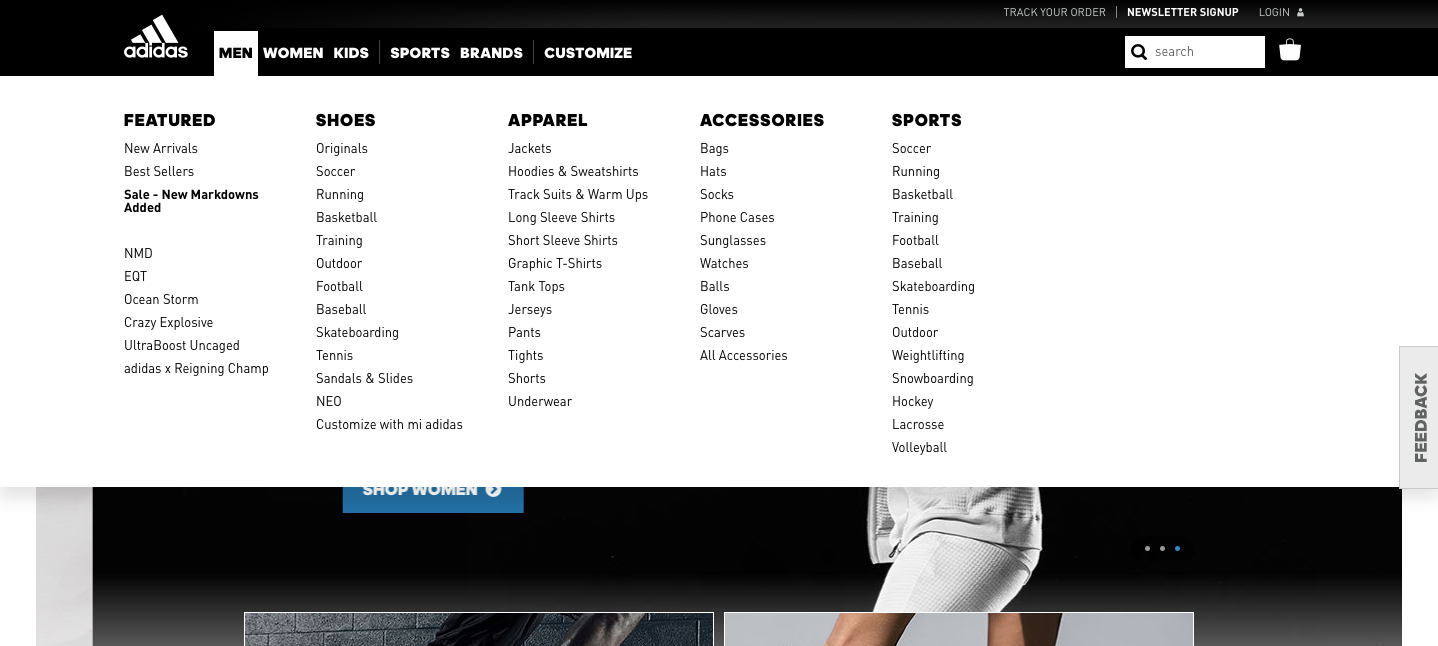
This is a perfect example of a neat site structure that will boost your rankings in Google’s SERPs and bring you more search engine traffic.
14. Simple design is scientifically more beautiful
While most of the opinions on websites are purely anecdotal, there are a few conclusions that are backed up by solid research.
One of the most pronounced findings is that simple website design is preferable to complexity.
A study conducted at Harvard University found that the color and complexity of a site accounts for 48% of the viewer’s visual appeal rating of the site.

To take full advantage of this finding, you’ll need to make sure your site has plenty of white space and focuses on just a few elements.
The point of this layout isn’t to win any design awards (though you shouldn’t complain if you do!), but rather to improve the likeability of your site.
If we like a site, we’re more likely to stay longer, read more, and even buy more.
A great example of simple focus is the site of designer Il-Ho Jung. He makes the site focus on his work, leading to a beautiful home page display.
The attractive layout encourages visitors to stay longer and possibly contact him to work on their projects.
15. Simple design puts the focus on the content
You don’t have a website so that people will read the ads, wonder at your logo, or admire your beautiful footer text.
You have a website so that visitors will take action.
Depending on your industry, that action might be signing up for a free trial, purchasing a product through your e-commerce store, or even learning more about your brand.
Whatever the action you want the user to take, you can use minimalistic design to aim a spotlight on it.
The Mozilla Firefox website is simple and draws attention to the main action the organization would like users to take: downloading the browser.
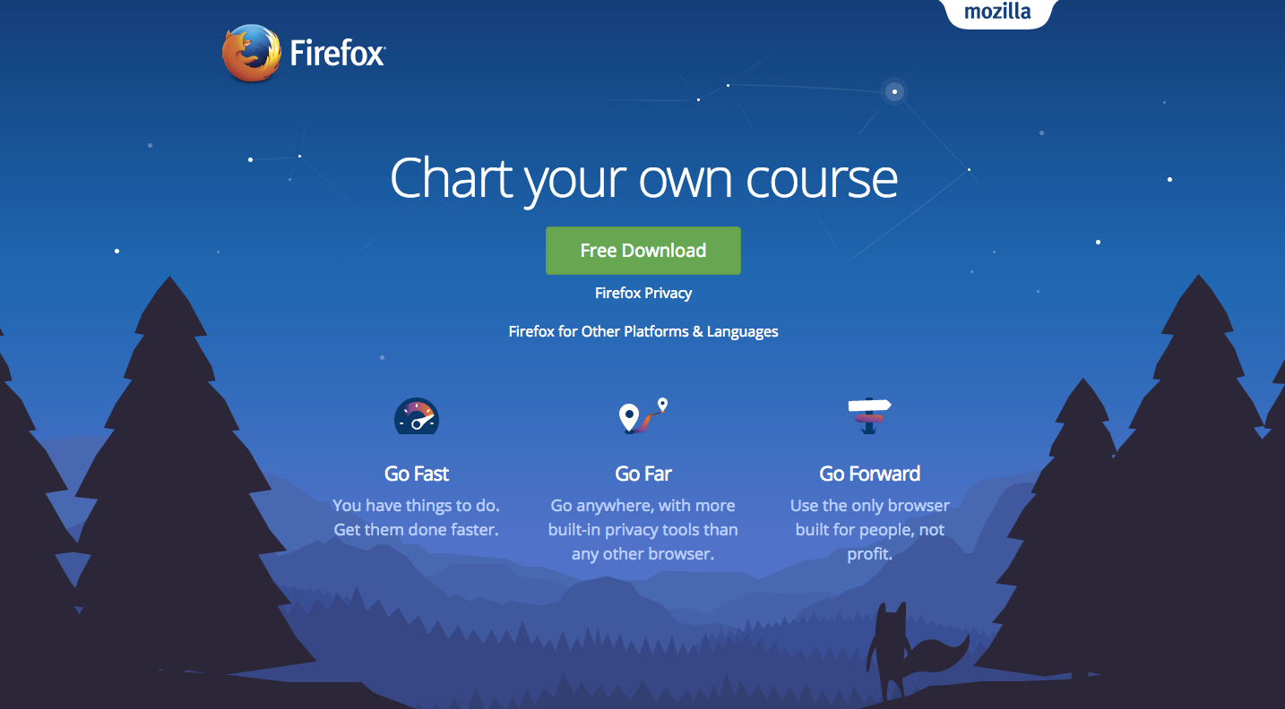
While there are a few other pieces of content on the page, they all support the main Free Download button.
But what if your goal is more long-term?
If you’re putting effort into building trust and authority through content marketing, you probably don’t want to sacrifice your entire site to one call-to-action button.
If that’s the case, simplistic design can help put the focus on your content marketing. The Buffer blog uses a lot of whitespace to draw attention to its articles.
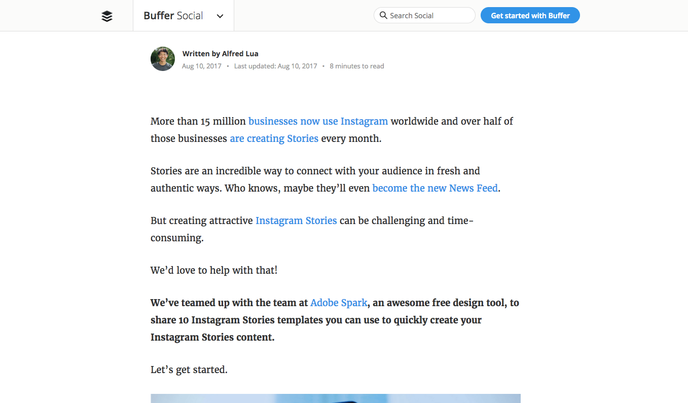
Instead of cluttering the page with ads or other distracting images, Buffer lets the content be the main focus.
The Buffer team has even removed the sidebar and promotional images to drive the user to engage with the high-quality content that serves as one of Buffer’s primary marketing tools.
16. Simple design is more memorable
Famous research by psychologist George Miller at Princeton has shown that we can only remember about seven pieces of information at a time.
Because of that, you need to think carefully about what you want users to remember about your website.
Since a huge number of visitors to your site will never subscribe to your email list or even return, you need to leave a lasting impression.
A simple design is a great way to do that.
By reducing the number of things on your site, you’ll increase the chance that they’ll remember the main point of your site hours or even months after visiting.
A beautiful example of memorable design is the Universidade de Coimbra.
It’s impossible to forget the bold and colorful architecture highlighted on the main page of their website.
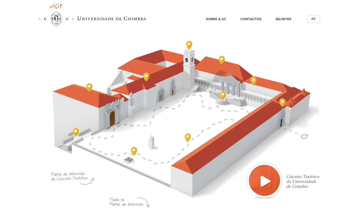
By sacrificing everything else for this one primary image, the university creates a clear mental picture that will be easier to remember than one on a crowded site.
17. Simple design allows you to shape the user experience
When there is a lot to look at, the user doesn’t know where to look. But when you can craft a simple and clean site, you can create a seamless experience.
With intentionally simplistic design, you can decide exactly how the user’s eye should move along the page.
The Nizo app website creates a distinctive user experience. It starts with a bold title and a short description.
The visitor then looks at the phrase “coming to the app store,” and sees an iPhone.
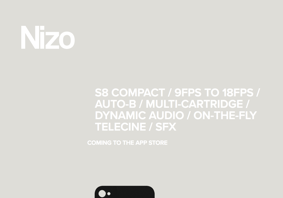
Upon scrolling, numerous pieces of technology gather from outside the screen and organize themselves beside the iPhone.
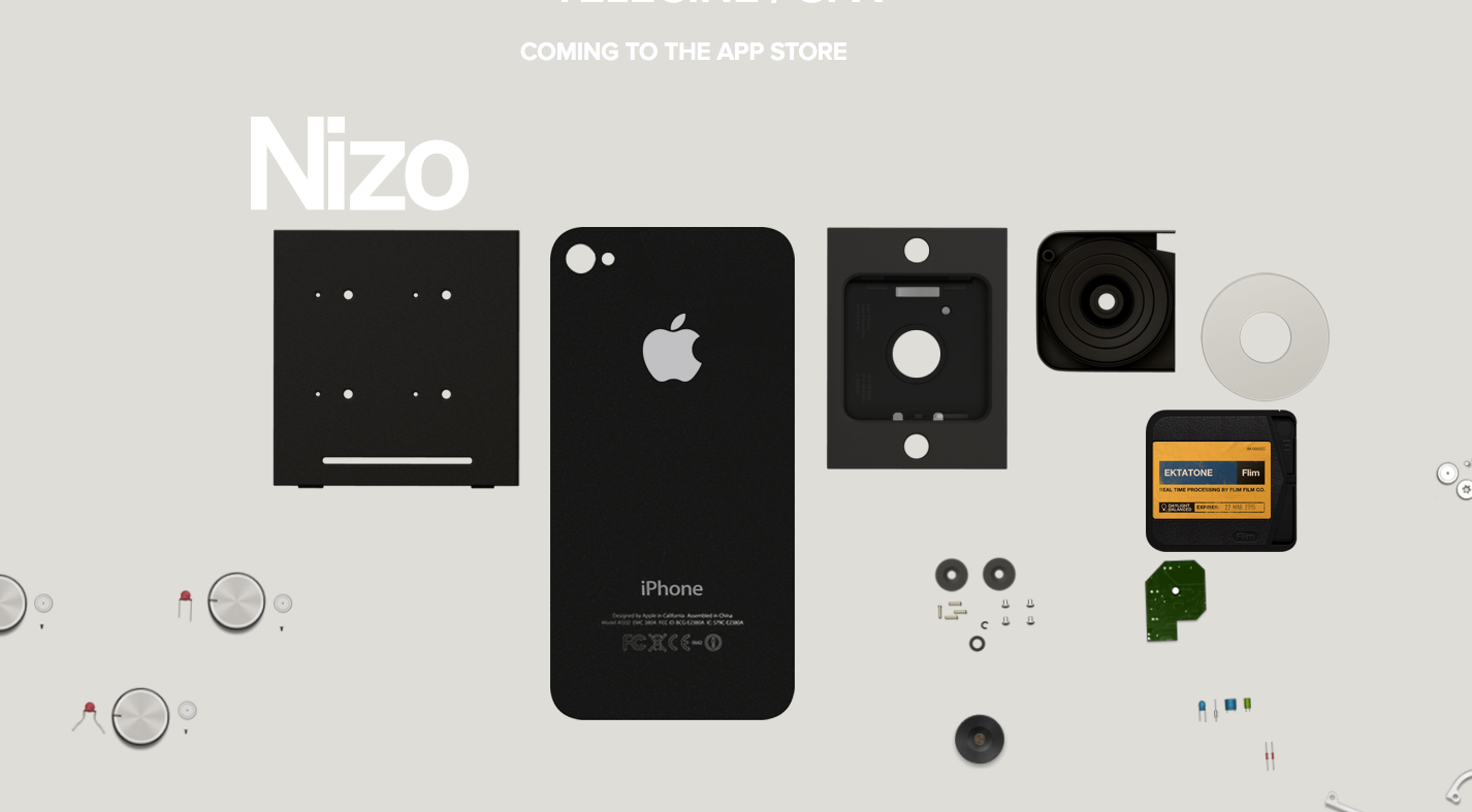
Finally, the main logo drops to the bottom of the screen and an email opt-in form appears.
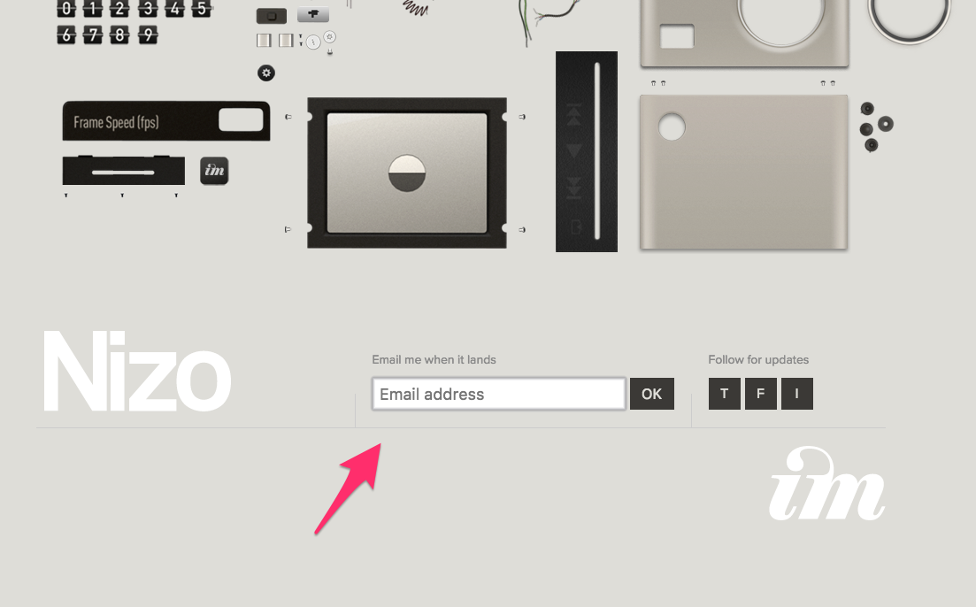
That opt-in form is the only interaction on the whole page, and your eye naturally finds it at the bottom.
The entire experience is guided to drive interest in the project and drive visitors to enter their email addresses to be notified when the app launches.
By using a clean design, Nizo is able to shape the entire user experience and drive one key action while telling a story in the process.
Conclusion
No matter your industry, you will be better served with a simple and clean website.
Not only will it boost conversions, but you will attract more people to the minimalistic, modern design.
Thankfully, it isn’t difficult to clean up your layout. Look for pieces to remove and focus on simple shapes and white space.
How will you simplify your website design?
The post 17 Reasons Why Your Website Should Have a Clean and Simple Design appeared first on Neil Patel.


Comments
Post a Comment